A symphony begins with a single note. The oboe sounds an A, and everything else tunes to it — strings, brass, timpani. Without that note, even the finest musicians, playing flawlessly, never quite reach the moment that stops a listener cold.
A high-end real estate website design project has its own version of that note — the thing that pulls an entire website into one coherent whole. Sometimes it's an idea. Sometimes it's the project's own character, held in a style that never wavers. Without it, a site stays a collection of techniques — each one impressive alone, none of them singing in the same key. But once that note is found, everything else falls into place around it. The elements start sounding together — and out of that harmony comes an identity nothing else could be mistaken for.
Here are seven of our best real estate websites that won Site of the Day on Awwwards. For each one, we'll tell you what became its note.
When the Architecture Suggests the Idea
Sometimes a project doesn't have a visual language yet. There's a logo, a handful of colours, a typeface — and the building itself. The easy move is to reach for whatever's trending: look at what everyone else is doing and stitch something together from familiar techniques. We go the other way and look to the architecture for direction, and it's this approach that shapes some of our best real estate website examples. The building already holds an idea. What's left is finding how to express it in design — so people feel the connection to the project, not just see it.
ERA: Facades That Defined a Digital Language
ERA is a quarter made up of six stepped Art Deco towers. When we started, the identity was barely there — a logo, a basic palette, nothing more. The visual language had to be built from the ground up, and we found it in the buildings themselves.
Art Deco is easy to read as glittering celebration — The Great Gatsby brought to life. But an ERA buyer wants something with more weight behind it than that impression. So we took the geometry, the clarity, the ceremony of the style, and left the sparkle behind — pointing the site toward a life full of purpose, not a party full of shine.

Everything on the site grew out of a single source: the details of the facades. Our designers traced the arch above a window, the ornament over the entrance, the pattern of a balcony railing — and those outlines became the site's visual language:
- background patterns and interface elements built around the star, Art Deco's signature symbol;
- a palette pulled straight from the architecture: blue deepened to the shade of an evening sky, rose gold lifted from the last light catching the facades;
- a line of light in WebGL running through the site as a visual thread — now the building's silhouette, now a trail behind the camera, now the shape of a headline;
- a live 3D neighbourhood map, cars moving along the streets, domes rising in the distance — the building set inside a real city, not floating on a blank plan;
- a hero render at roughly 8,000 pixels, with the camera scrolling through it to reveal the facades detail by detail.
Every choice came back to the same idea: the building's own architecture gives its digital version its language. How that plays out in motion and feel is best seen in the full ERA case study.
AIR: Architecture in Motion
AIR is a futuristic business centre — three towers where every floor rotates slightly against the one beneath it.
At the heart of both the architecture and the site is the same energy: ambition, growth, the pull upward. The site speaks to people looking for a new home for their team, and from the first seconds it tells them: here, your work reaches a level it hasn't touched before. Through fluid storytelling, immersive 3D animation, and a carefully considered interface, AIR lets prospective tenants feel what their future workplace might be like — long before they ever walk through it in person.
The client arrived with a brand already in place: a logo, a typeface pairing, a few basic elements. But a traditional identity and a digital environment answer to different rules, and carrying one over directly loses both the building's character and everything interactivity can offer. So we kept the logo and the typefaces. Everything else was built from the ground up, around one idea the building itself pointed to: the flexibility and plasticity of form.
The name was our starting point. We took it literally — gave the compositions more air than usual, opened up the spacing between letters and words so every screen had room to breathe. From there, the graphic language picked up the same thread:
- 3D graphics drawn straight from the movement of the towers: floors rotating against each other like a deck of cards fanned out diagonally, recursive forms, spirals, flowing lines that come alive as they turn;
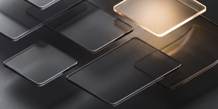
- semi-transparent, frosted interface panels echoing the glass facades — as if the interface were cut from the same material as the building.
But AIR's flexibility isn't only architectural, and it isn't only graphic. It's built into the logic of the product itself, and the site had to speak that language too. The centre sells space on flexible terms — an office starting at 53 square metres, or several spaces on a floor combined into one, all the way up to an entire building. Nothing off the shelf covered that scenario, so we built the configurator from scratch: the user selects adjacent offices and watches them merge into a single space, with a combined area and a combined price forming in real time.
One idea — the flexibility and plasticity of form — ran through the whole project, from the rotating towers in the graphics to a functional logic a prospective tenant can feel before they've even picked up the phone. How it all moves — in the AIR case study.
In both ERA and AIR, the thinking started with architecture: the facade details of one, the rotating towers of the other. Reading that language and carrying it onto a screen — that's the first way to find the note.
Likova: The Crystallisation of Possibility
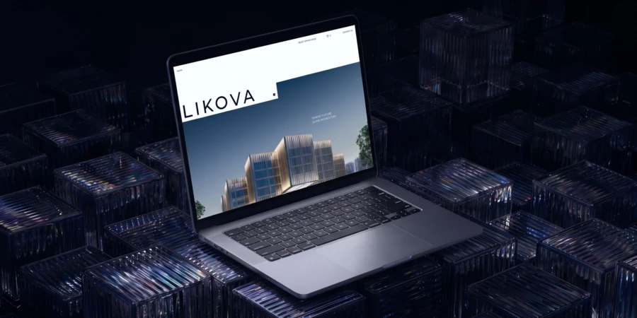
Likova is a business centre that reads like a floating crystal. Its cosmic architecture speaks to a kind of ambition bold enough to make a business take flight — and to a level of comfort that makes people genuinely want to come to work. A project with prospects like that needed a site where its essence could crystallise too.
The idea came straight from the architecture: stepped, transparent planes. That step — Likova's elementary particle — became the foundation for the whole project and its signature move. As the user scrolls, cascading panels flow into one another, and the building seems to transform right in front of them.
Every design decision follows that same logic of transformation — rich storytelling, rhythmic animation, a WebGL scene built around a 3D model of the building, an interactive 3D site plan. The same energy of building toward the future runs through each one:
- an interactive WebGL 3D scene lets the user rotate the building, uncovering new angles and perspectives as they go;
- an abstract 3D object carries the energy of the place, light breaking across the crystal's facets in a gesture toward everything Likova makes possible;
- the site plan, built in WebGL, rotates to reveal the full richness of the centre's infrastructure;
- custom 3D illustrations, their layers drifting at different speeds, build a real sense of depth — so exploring the project feels genuinely immersive rather than staged.
Contact with the future should feel effortless. That's why the project has two office selectors — a visual one and a parametric one with filtering by specific criteria. Future residents can choose intuitively, by image, or precisely, by requirement.
Every technique holds to one consistent style, and each reflects, like a facet of the crystal, what Likova is really about: bold ambition, premium quality, and the kind of comfort people get to live inside every working day. How to communicate a business space built to inspire — in the Likova case study.
When the Idea Needs to Be Delivered, Not Discovered
Sometimes a client already arrives with a strong conceptual foundation — this is common with luxury real estate websites, where the brand identity is often set before the site design even begins. In that case, the task shifts: there's no idea left to find — it just has to reach the screen intact. That's harder than it sounds. A strong thought dissolves easily in translation, if it only holds up on the first screen and fades from there.
Springs: Meditation at the Heart of the Site
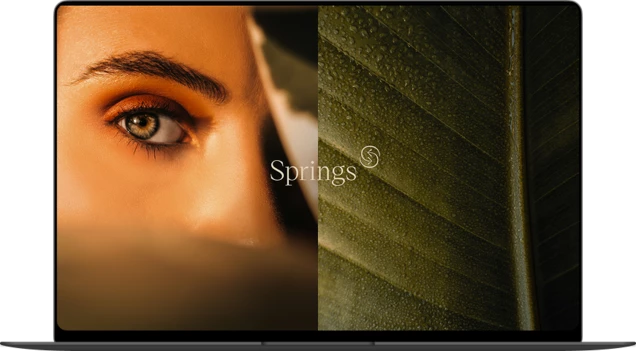
Springs is a club residence with a spa complex, a private enclosed garden, and a park right at the doorstep. The idea came to us fully formed: home as a source of renewal, a place you return to in order to restore yourself — physically, emotionally. The concept was already there. Our job was to carry it onto the screen without losing a thing.
We started with workshops alongside the developer — going through the project from every angle to understand what made it distinct, what competitors were offering, what future buyers hoped for and where they hesitated. That research became the foundation for the site's strategy and storytelling.
We distilled the whole idea down to a single sensation — meditation — and let it shape every decision:
- an unhurried rhythm: smooth movement, lyrical copy, a hypnotic visual that shifts gradually, never abruptly;
- WebGL transitions where planes dissolve into one another and the interface responds to the cursor's slightest move;
- a visual selector: a full-screen render of the building set deep in greenery, where visitors can go as deep into the detail as they want without ever losing the sense of the whole;
- copy that stays soft when it needs to set a mood, and sharpens into precision the moment it needs to state a fact.
By the first screen — before knowing anything about Springs — a visitor already feels understood. Text and design move together, carrying forward the sense of an inspired life waiting for future residents. How the Springs site is built.
Silver Pinewood: Quiet Luxury in the Details
Silver Pinewood is built around a single idea — quiet luxury: restraint as an aesthetic, quality with nothing loud about it. The client brought rich material to the table, photography commissioned specifically for the project among it. What was missing was a solution that could carry that concept onto the screen.
We refined the brand, brought the visual language into line with the idea, and cut away what didn't belong. Quiet luxury needed to be pulled closer to something lived-in — someone choosing a home, choosing a place for their family. The site holds both things at once: the feeling of home, and an understated aesthetic. A pastel palette, layered compositions, an even scroll rhythm, copy that speaks to the visitor directly.
Quiet luxury isn't the same thing as invisible. The worst possible outcome would be a visitor who scrolls through and, an hour later, can't recall what the site was even about. The craft is in placing accents that never announce themselves — but stay audible all the same:
- the Territory section: a deceptively simple screen that stops the scroll. Precise composition, stone textures catching reflections, animation timed exactly. The smooth metal slabs in frame are lifted from the courtyard fountain, brought to life on the site as something that moves;
- the marble Zeus from the lobby, rebuilt in WebGL: weight and weightlessness at once. Visitors carry that same metaphor over to the product itself — a place where solidity and ease coexist.
Attention to details that never announce themselves raises the perceived value of the product — quietly, but unmistakably. The Silver Pinewood case study.
The Power of a Pure Style
Not every strong site comes with a concept you can sum up in one sentence. Sometimes the note is the style itself — held so consistently, so precisely, that a project is recognisable from the first screen and never once slips out of register. That's a skill of its own: not finding an idea, but capturing a project's character perfectly, without a single misstep across any page. When style is held at a hundred percent, it works just as powerfully as an idea would. The site feels whole — and you feel that wholeness immediately.
Poklonnaya 9: A Project Where the Seasons Turn
Poklonnaya 9 is a premium residential complex with a high-end hotel across its lower floors, an Art Deco facade, and interiors with real depth to them. The project is vivid and full of character — it catches you from the first glance and doesn't let go until the last page.
We expressed that character through shifting states, so the project genuinely lives through the turning of time on screen:
- seasonal design: darker tones for autumn and winter, light for spring and summer, and a separate New Year version — a reminder that life in the quarter keeps going all year round;
- a "Spend a day at Poklonnaya 9" section built as a round-the-clock format: morning to night, told as one continuous story;
- different design patterns across different pages to keep attention alive, with the hotel's story woven naturally into the whole;
- visual apartment selection with easy filtering by parameter.
This isn't a mode switch for the sake of novelty. Shifting states turns a static project into a living story — one that moves with time, all inside a style that never breaks stride, not for a moment. The Poklonnaya 9 project.
Ever: The Harmony of Contrast
Ever brings together what doesn't usually belong side by side: city life and the quiet of a garden, modernity and nature. That contrast is the whole idea — and the site says so from the first screen: urban against natural, masculine against feminine, warm against cool. The entire visual language grows out of that eloquent opposition.
Contrast runs through the whole site and pulls the visitor along with it. The homepage — dense, constantly shifting — reads like a good fashion magazine: one detail of the project follows another, and it's hard to look away. Contrast here isn't a single effect spent on the opening screen. It's a thread that holds the impression together all the way to the end. The Ever project.
Beyond the Beautiful Image
The Site as a Guide, Not a Showcase
In the ultra-premium segment, a website carries a particular kind of weight. It isn't a shopfront, and it isn't a presentation living on the internet — it's the connective core of the project, the one element meant to gather everything the project does best and carry it outward. This is exactly what separates a custom real estate website from a templated one: make the site merely striking and technically impressive, without ever getting to the heart of the project, and the whole effort is wasted — visitors are left holding nothing but a beautiful emptiness. Find the project's real meaning, though, and translate it with precision, and the site starts to earn its keep. We go into how this works at the level of principle and strategy in a separate piece on real estate website design.
Real Estate Isn't Bought on a Single Visit
An idea, or a style held with discipline, is what makes a site feel whole. But real estate isn't something people choose on impulse, in one sitting. Buying an apartment or an office unfolds over time — people come back, compare, weigh the location, the layouts, the infrastructure, the developer's track record. The site has to carry weight across that whole journey, not just land a strong first impression. Which is why, behind every beautiful surface, there's real work happening — the kind that comes from actually understanding how decisions get made in this segment.
That work shows up in the services that never call attention to themselves. The apartment or office selector is the primary tool that brings prospective buyers back: it lets them filter by what matters to them, while the project's overall feel stays intact around them. Honest content — like ERA's seasonal renders, which show the project outside of an eternal summer — builds trust. AIR's configurator lets a prospective tenant feel the product's flexibility before they've even called a manager. All of it answers the same question: how does a buyer really decide?
Why Coherence Works
There's a reason coherence works, and it's rooted in how perception itself functions. The mind grasps the whole before the parts — we hear a melody as a unity, not a sequence of notes — and the more effortlessly an image reads, the more its beauty and its credibility feel beyond question. A set of effects pulling in different directions never lets that unity form, and the impression comes apart, no matter how skilled each individual technique might be on its own.
And there's one more thing without which idea, style, and beauty all fall apart: execution. The most refined aesthetic collapses the instant an animation stutters or a layout shifts awkwardly on a phone. That's why our sites are pushed to flawless performance: heavy WebGL scenes and renders stay smooth on any device, not just a powerful desktop. The marble Zeus of Silver Pinewood rotates without a single hitch on a phone. ERA's scenes hold their full detail without losing speed. Every animation is calibrated so nothing catches or snags between screens and scenarios. All of it in service of one thing: the site should breathe evenly and deeply, and the visitor should feel the quality without ever having to think about it.
How to Recognise a Strong Team
The clearest tell is how deep they go with strategy — how seriously they search for the one idea that carries the whole communication. Technology on a site is only worth as much as its precision in conveying what the project actually is. A team's real experience shows in its portfolio and the range of what it does: designing a site is one thing; building a project's meaning from the ground up is a matter of real estate website design in the fullest sense — the kind we set out in our piece on digital branding.
What Sits Behind All of This
Seven projects, three different answers to one question. The idea came from somewhere different each time, but failure would have looked identical across all seven: techniques living for their own sake, a pile of effects adding up to nothing. Each of these sites earned its place because it found its own true note — an idea, a style held with conviction, something for everything else to gather around, from the first screen to the last.
If you're looking for a team that starts with a project's substance rather than a striking picture — take a look at what we do: real estate website design.
Get the edge with award-winning design and development for your real estate project!
Insights