
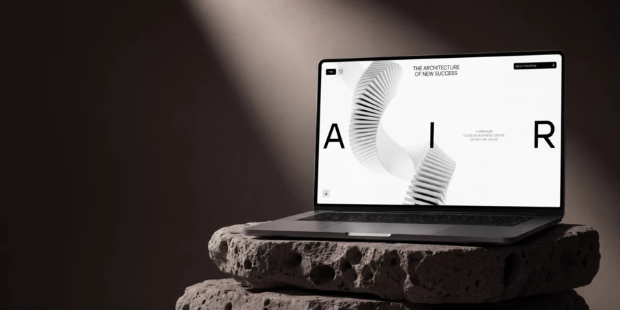
AIR — digital branding and website for a premium business center with a luminous atmosphere
View CaseA person can be beautiful on the outside — we admire their features, their bearing, the way they dress. Inner beauty, with its depth of thought and quiet inspiration, is not immediately visible — but it is what truly captivates. Attractiveness with nothing behind it quickly loses its appeal; this becomes clear at the first real conversation. Design works the same way. Elegant forms without an idea are nothing more than an empty shell — one that leaves no impression.
An idea is the soul of a product. It doesn't appear on its own — it is found and refined by the person who builds the project. A strong idea drives decisions: the designer doesn't reach into a catalogue of trends for abstract techniques; the idea itself suggests what each element should be. Graphics, space, rhythm, motion — everything grows from a single root, and that is why it feels whole. Style doesn't get assembled; it emerges. The Air business centre real estate website design earned Site of the Day on Awwwards — and as with all our projects, it began with a single idea that determined everything that followed.

The Brief: From Traditional Brand to Digital Identity
Air is a futuristic business center with glass facades and rotating towers, each floor turned relative to the one below. Three buildings ranging from 14 to 34 storeys, offices from 53 to 1,600 m² with the option to combine — up to an entire floor or building. The architecture is bold, contemporary, and full of character. The contours of the flowing towers appear caught mid-dissolution, as though swept by a wave that becomes the defining force of the design.
The client came to us with an existing brand: a developed logo, a set of typefaces, and basic brand elements. But traditional identity and the digital environment operate by different rules — translating one directly into the other means losing both the character of the building and the possibilities that an interactive format offers.
The site had several objectives: to communicate the positioning of a next-generation business centre — not simply an office building, but an architectural statement with premium infrastructure; to allow different audiences — from IT startups to corporations seeking a headquarters — to quickly find their office space and understand the advantages of its flexibility; and to do all of this at a level consistent with a project that, as the site itself states, "has no competitors at this level."
We took the logo and type pair from the existing brand. Everything else — the graphic system, compositional principles, motion, and visual language — had to be built from scratch. In essence, this was not simply a design concept phase; it was the development of a digital brand: the evolution of a traditional brand into a complete visual system that lives on the site and shapes how the entire project is perceived.
A Visual Language Born from the Architecture
The starting point was the name: Air. We took it literally. Negative space in compositions was given more room than convention allows. We used unconventional letter and word spacing in the headlines, reinforcing the sensation of lightness. Every screen breathes — and this is not a decorative technique, but a direct reflection of the meaning embedded in the project's name. But air and typography alone were not enough to form a distinctive identity. The site needed its own graphic system — and we found it in the building itself.
Air's rotating towers are floors turned relative to one another, like a deck of cards shifted diagonally. We translated this dynamic plasticity into custom 3D graphics: recursive forms, spirals, and flowing lines. We first realised these in static illustrations, then in video — bringing them to life through smooth rotation and transformation. The motion added elegance, but more importantly, it conveyed what a static image cannot: the sensation of architecture in movement.
The transparent elements in the interface — semi-transparent panels with blur — followed the same logic. This is not glassmorphism borrowed from Apple; it is a direct reference to the building's glass facades. Glass is Air's defining material, and we carried it into the digital environment: the interface feels as though it is made from the same material as the building itself.
Lightness, airiness, sophistication — everything converges. We suspect our concept may have subsequently influenced Apple's decision to adopt the new transparent design language of iOS 26. Though for a real estate web design agency like ours, transparency is never decorated — it is grounded in a specific idea inspired by Air's glass facades. What idea justifies Apple's transparency — that, it seems, remains an open question.
Each of these techniques — air in the composition, 3D graphics that echo the plasticity of the towers, glass in the interface — was not chosen at random. All of them were dictated by a single idea: to translate Air's architecture into the language of digital design. This is why together they read not as a collection of impressive features, but as a coherent digital identity that builds the right image of the project.
Website Design: The Flow of the Narrative
A visual language is a set of rules. On the site, those rules begin to work together, producing a clear effect of synergy. And what matters here is how that synergy is felt. The first thing a user feels when the homepage opens is rhythm. The content doesn't press or rush — blocks succeed one another fluidly, without sharp breaks. The user doesn't scroll through the page so much as move through it. Graphics respond to the scroll; the interface answers to movement. Each screen flows softly into the next, holding a consistent tone: the user understands that this is not a collection of beautiful but disconnected pages, but a single coherent statement.
Every page is rich — holding the balance between beauty and information. The construction progress section, internal pages, secondary screens — all are made as though each were the only page on the site. We believe that with the right approach, both a team and a project are capable of more than seems possible at the outset. And we know that work doesn't exhaust when it brings pleasure — and it brings pleasure when we watch a beautiful, harmonious project grow from a limited set of client materials.
This is why we almost always work with existing branding — not to remake it, but to fully realise its potential in the digital environment. Air is a clear example: from a logo and a type pair, a coherent system grew that was able to unlock the project's potential in a way traditional identity never could.
The concept was accepted with almost no revisions. When an idea is precise and elegant and all decisions follow logically from it, the client doesn't need long to see that it will work in practice. We didn't need to explain what made the site innovative or beautiful — because the site itself was the explanation, revealing the essence of Air.
The Office Configurator: Outside the Boundaries
One of the client's requirements was unlike anything we had encountered: this real estate web design needed a function for selecting and combining multiple spaces on a single floor. This is how Air sells offices — flexibly, with the ability to configure layouts around each future tenant's specific needs.
We didn't look for an existing solution to adapt — because there wasn't one. No reference would have covered this scenario: a configurator where you select several offices on a floor plan and watch them merge into a single space, with a combined area, a unified layout, and a total cost. So we designed and built it from scratch.
The result is an interface where complex product logic feels effortless. You see the floor. You select one space, then the one next to it — and they become one. No forms, no requests to a manager at this stage. Just a configurator that lets you feel the flexibility and adaptability of the product before the first call. This reflects the logic that runs through the entire project: don't copy what already exists — design from the brief. If the solution isn't out there, build it. And make the complex look simple.
A Deep Idea. An Atmospheric Implementation
This project turned out exactly as it should have: consistent with the project's class, precise in conveying the sensations of lightness, sophistication, and premium quality. From a logo and a type pair, a complete digital system grew — alive, dynamic, and impossible to forget.
Plato called this the eidos — the ideal form that exists before any realisation in material, colour, or line. Everything visible in a thing, in Plato's view, is merely a reflection of the idea behind it. In design, this holds literally: without an idea, decisions are random, techniques are disconnected, style is determined by the designer's taste alone. When the idea is found, it becomes the eidos itself, and every element grows from it organically. This is exactly what happened with Air: the name, the architecture, and the materials of the building converged into a single thought — and from that thought, everything on the site grew, from the graphics to the spacing between letters.
Putting an idea at the heart of every project is not a pursuit of self-expression. It is the desire to create something that inspires — something that speaks to the people it was made for in a language that is plain and human. The key meanings don't stay in the headlines; they are felt in every visual decision — graphics, motion, space, and rhythm. The whole system of techniques works not to create an impressive effect, but to carry a single precise thought. And the language in which all of this is said is understood by everyone — simple and sincere.
We specialize in luxury real estate website design — building sites for the premium and high-end property segment. International awards and clients around the world. If our approach and the level of our work resonate with you, get in touch.
Get the edge with award-winning design and development for your real estate project!