Building a website for premium real estate means walking a fine line between feeling and reason. Buyers do their homework — location, materials, amenities, all carefully weighed. But even the most clear-eyed, practical buyer isn't really looking for square footage. They're after something harder to name: renewal, a life reordered, a fuller version of themselves.
That's the real challenge of luxury real estate website design — and for Springs, we met it in the language of feeling rather than specification. Every detail was crafted to carry the brand's singular character. A visitor browsing floor plans or reading about the landscaping absorbs more than information — they absorb Springs itself, and what it quietly promises them.
The Client and the Brief
Springs is no ordinary club residence. Transparent, futurist architecture meets resort-grade living — a full spa complex, a private enclosed garden, green terraces wrapping the facades, a park right on the doorstep.

But none of this is just a selling point. It all feeds into something rarer — a genuinely considered brand that actually knows what its buyers are looking for. Springs is a source of renewal. People don't come here to buy property. They come to claim a personal sanctuary — somewhere that gives them back to themselves, mentally, emotionally, physically.
Strategy — the Analytical Dive
We began with a series of workshops with the developer — going deep into the project from every angle: its defining qualities, the competitive landscape, the hopes and hesitations of the people who would actually be buying here. We never move forward until we have the full picture. That understanding is what separates a site that looks right from one that actually performs. Out of the research came the site strategy: clear objectives, a solid structure, every conceptual and functional decision accounted for. That's what luxury real estate website design looks like before a single pixel gets placed.
From the Springs concept, we built out a constellation of associations — the feelings the project needed to carry: the softness of nature, the privilege of solitude, the pleasure of quiet contemplation, an exclusive kind of warmth, calm luxury, prestige and soul held in balance.
Why does a real estate website need associations this layered? Because the more facets a diamond has, the brighter it catches the light — and the more it's worth. The richer the experience on the site, the stronger the connection a visitor forms with the project. They came to look. They leave with Springs already meaning something to them.
So how do you actually light those associations up? We started by building the storytelling — a narrative structure that carries the user through the site. Then every element was designed to serve that structure, so that each scroll surfaces something true about what Springs is.
The Client Is the Story
Buying property is a decision people spend time considering. They think it over, come back to it, think it over again. The Springs site meets them inside that process. Through a carefully layered narrative, it shows prospective buyers that Springs understands what they're hoping for — and what's giving them pause — and that it has the answer.
Choosing an apartment in a luxury development is really choosing something deeper: the chance to become more fully yourself. More grounded, more vital, more alive to your own possibilities. That's what Springs actually offers. And that's what the site needed to say.
So we built the feeling of a meditation into it — an unhurried rhythm, copy with lyricism, visuals that shift and breathe and pull you in slowly.
From the very first screen, before a visitor knows anything about Springs at all, they feel understood. That makes everything easier — they settle into the project, warm to it instinctively, and take in what it's offering with genuine attention.
One Concept, Carried Through Everything
Every decision on the site answers to a single idea — from the opening screen to the apartment catalogue to the contact page. Every detail speaks of Springs: a home in quiet symbiosis with nature, where a person can come back to themselves completely.
The site doesn't only speak to the eye. It reaches for the other senses too — touch, sound, even scent. We chased that effect through the combination of visual inspiration and precise, considered copy.
Inspirational Design
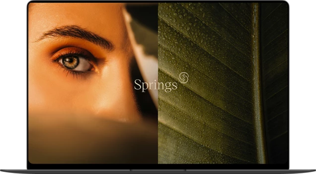
The site is rich with evocative imagery and visual metaphor — each one adding another layer to the atmosphere that is distinctly Springs. Dewdrops catching in sunlight. The stillness of park pathways. The scent of flowers on an open terrace. A visitor doesn't browse the site so much as step inside a vivid, three-dimensional picture of the life ahead of them.
Elegance, lightness, freshness — they take hold quietly. Frame after luminous frame, full of air and clarity, seems to carry sound and scent along. Transparent imagery, close crops, surfaces with a soft blur at the edges: together they build the mood of a life lived fully, in harmony with nature.
WebGL Motion Design
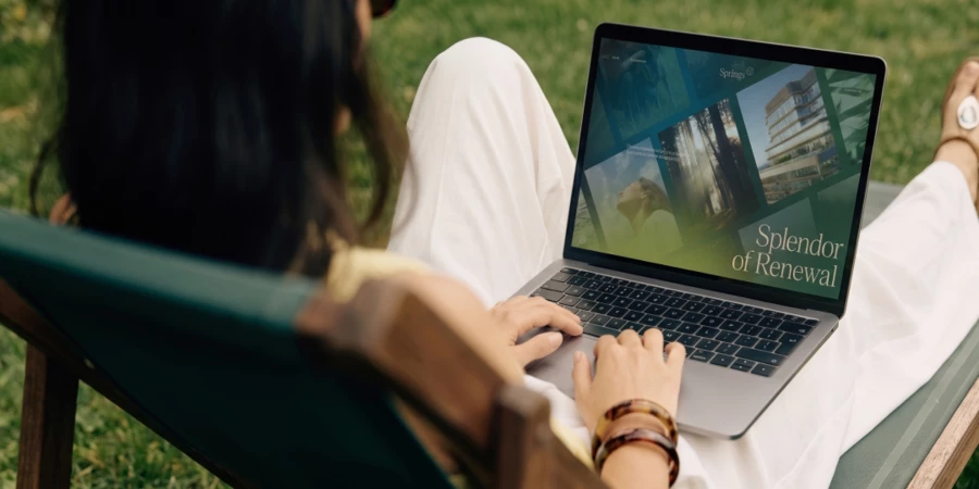
The dynamic effects and gradient transitions are built in WebGL — a technology that lets visual planes merge organically, making the whole experience feel seamless and pulling you through it. Every transition between screens becomes something worth noticing. Move the cursor, and the interface responds — motion that's always present, never intrusive. Details like these carry as much meaning as any written description of the project. In small interactions, visitors read Springs' attention to the particular — and feel its atmosphere firsthand.
The Visual Property Selector
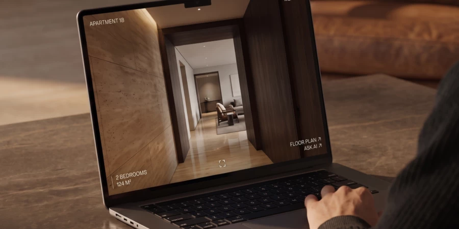
A full-screen render of the building, wrapped in greenery — photorealistic and perfectly in tune with the brand. The visual selector is Springs in miniature: aesthetics and utility in easy balance.
The UI/UX is thoughtful enough to feel effortless — using it is genuinely pleasurable, not just functional. Visitors move through the floors the way you might run a hand along a facade. They get a feel for the whole building first, then drop into whatever level of detail they're after.
Writing That Breathes
The copy has the quality of watercolour — delicate and transparent, yet precise where it counts. It draws the reader into an emotional, meditative account of Springs, one that moves at its own unhurried pace.
Behind the words, the shape of a beautiful, considered life begins to emerge — the one that's waiting. Emotional writing lets the client feel the project more finely than any list of features ever could. Text and design work as one, both reaching toward the same thing: beauty that carries meaning, value, and its own quiet soul.
The Site Feels Like the Product
The result is genuinely refined. Springs' site feels weightless and substantial at once — exclusive without announcing it, authoritative without trying hard.
The technically complex design decisions were executed without compromise, and the site is optimised to land its full effect even on lower-performance devices.
That level of care doesn't go unnoticed — and it transfers directly to how visitors perceive the product itself. Springs reads as boldly innovative, while never losing its lightness, its grace, its sense of something almost airborne.
The Result. A Home That Opens You Up
The Springs site stops you — even if you're not in the market for property. It gives pure aesthetic pleasure. Some visitors get goosebumps. The design community noticed too: the site won Site of the Day on both CSSDA and Awwwards.
Beautiful design raises the perceived value of a project, but that's only half of it. What matters more is that every detail answers something the client was already feeling. The site carries one clear message: this is where you rest. This is where you find yourself again.
Springs couldn't be mistaken for anything else. The site builds an image that belongs entirely to it — layered with meaning, charged with value. That image is what we build for. It's the whole point of being a luxury real estate website design agency.
Get the edge with award-winning design and development for your real estate project!