Real beauty is never just skin deep. Somewhere inside every person is an image of their own perfection — waiting to be found and given form. That's what any true craftsman is for: the artist, the sculptor, the designer, anyone making work that takes your breath away.
A plastic surgeon does the same thing. He sees the beauty already there, draws it out, brings it to its fullest expression. Building Dr. Grigoryak's site, we tried to carry that exact feeling — a quiet, refined kind of beauty — from the first screen straight through to the last.
An empathetic approach. How do you feel about a client?
Nobody decides on plastic surgery overnight. It takes time, and it's never easy — a patient is handing their body to someone else, weighing the risk, dreading the pain, wondering how they'll look and feel once it's over. Before anyone says yes to surgery, the fear has to go first. So this site couldn't start with design. It had to start with understanding exactly what that fear was made of, and what might actually dissolve it.
We dug into the field, mapped the competition, found what makes Dr. Grigoryak different, and how he earns a patient's trust before they've even met him. That's what shaped the site's structure and its core message — not a "book now" but calm, expert answers to the questions a patient is already asking themselves, long before they're ready to decide.

One idea holds the whole site together: your beauty, refined to perfection, and the surgeon's skill, sharpened by years of practice. Two threads woven into one rope — and together, they pull hard.
The patient's beauty meets the surgeon's mastery. A good surgeon doesn't impose his own idea of beauty — he uncovers the full potential already there. This single thought set the tone and the logic for everything we told.
The soul of digital branding. Where does the core idea come from?
Most clients ask us for the same thing: a "beautiful, modern website." But underneath that ask is something they haven't quite put into words — a need to show their brand at its absolute best, with every strength on full display. An effective website can't just be impressive — it has to say something about the brand, not just show off a striking image.
Beauty without an idea doesn't last. A site that's only a string of striking visuals gets a wow that fades fast, because looks without substance can't actually persuade anyone of anything. Real digital branding imbues visuals with meaning — the site stops being a highlight reel and becomes more like a film, one that actually tells you who the brand is.
Every project starts somewhere different, and that shapes how we begin. Sometimes there's a full identity already in place, and we adapt it for the web. If all we're given is a logo and a palette, we build a full digital identity around them. And sometimes there's nothing yet at all. With Dr. Grigoryak, there was no image, no core idea, no content — nothing to design around. So we didn't open with a layout. We opened by figuring out who this surgeon is and what he actually wants his future patients to know. The copy and the design both came out of that deep dive into his values. That's why the site feels so focused and cohesive — it grew out of one strong idea rather than being stitched together from design tricks. We go deeper into this process in a separate piece on digital branding.
Storytelling. Who's the hero — the doctor, or the patient?
An immersive story belongs to the patient. The site is built like a narrative: a hero (the patient) facing a problem (the feeling that something isn't quite right) and a guide (the doctor) who meets them with care, precision, and quiet authority — leading them toward a safe, beautiful transformation.
That guide earns trust fast. A portrait against deep, velvet black, a gaze that's warm and attentive, hands brought into sharp focus — the same hands that perform the magic of plastic surgery — and a patient is already imagining the consultation. Empathy runs through every step of it: the first meeting, choosing a procedure, the surgery, the recovery. At no point does the patient feel alone in it. That kind of genuine care is what makes the doctor's skill feel exceptional, not just competent — and that's the story we told.
The homepage pulls the reader into that transformative world, and everything after it unfolds the doctor's expertise — his rare eye for beauty, his hand, his judgment. Every section on the site quiets a specific fear. Can I trust this doctor with my health and my appearance? The "What success is built on" section — skill, accountability, a strong team, full support — answers with a clear yes. "Seven steps to a new you" removes the fear of not knowing what's coming because the patient can already see the whole road ahead. Step by step, the empathetic story carries them through the entire medical journey, and at no point does it let them feel unsafe.
The two flagship procedures — rhinoplasty and breast augmentation — get full, vivid explanations, illustrated scenes, and real detail. And still nothing feels overwhelming. Patients find what they need without drowning in medical language.
There's a subtle break from convention here too. Most doctors' sites open with the doctor. This one opens with a striking young woman instead — someone a patient can picture becoming. The doctor appears a beat later. By then, the visitor is already inside the feeling the site creates, calm and drawn in — and only after that do the specifics of the procedures arrive.
Premium branding. Luxury lives in restraint
Dr. Grigoryak's website is what premium actually looks like when it's done right. The obvious — and wrong — way to chase that feeling is to pile it on: gold, shine, heavy accents, every "expensive" trick available. That's what cheap luxury looks like. Real premium quality doesn't need to prove anything — it has room to breathe. It comes from less, not more: a light hand with composition, open space, restraint everywhere you look. The reader needs space to move between screens and ideas.
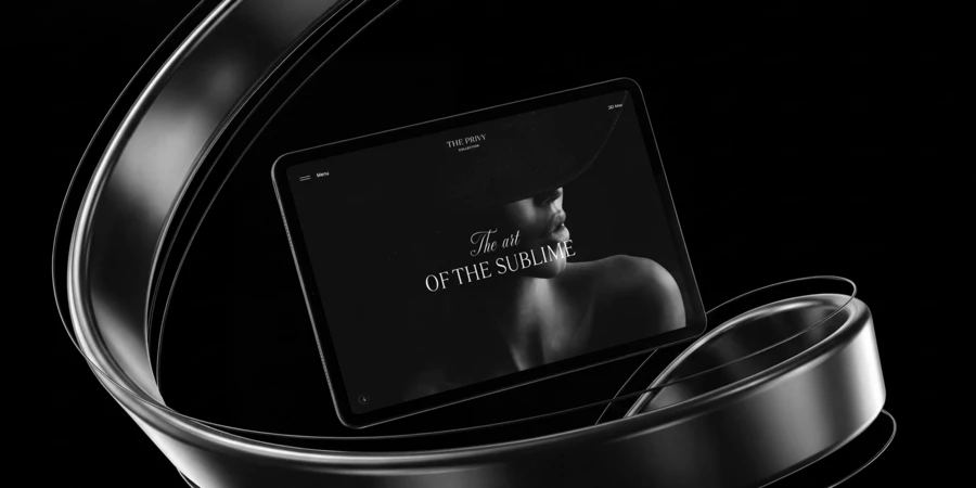
The whole project draws on the aesthetic of a magazine. The site feels like a glossy, expensive publication devoted entirely to one person. Bold typography, generous white space, magazine-style framing, a smooth rhythm that unfolds the content step by step. That kind of magazine signals a curated, deliberate approach — careful selection, refined presentation. Dr. Grigoryak's site communicates premium quality before a visitor has even read a word. We made the whole project feel both magnetic and slightly aloof at once. The doctor's professionalism becomes something to admire, plastic surgery becomes a form of art, and the patient becomes the work itself.
A dark background carries that glossy-magazine feel through the whole site — shapes and details surfacing slowly out of black, the way light pulls a piece out of the dark in a gallery. It's striking, but it's calm — there's nothing clinical in sight, so the anxiety never really gets a foothold. The reader is too absorbed in the aesthetic, too drawn into the story of their own upcoming transformation, to feel afraid. For a patient choosing a plastic surgeon, a site this considered says everything it needs to about the outcome — without ever stating it outright.
Aesthetics Sells. An aesthetic product reads as flawless, because we intuitively take "beautiful" to mean reliable and well made. For a patient choosing a plastic surgeon, a site this immaculate makes a persuasive case: the outcome of the surgery will be just as striking.
Structure. Surgical precision, a gentle touch.
Nobody books plastic surgery on a whim. People come back to a surgeon's site again and again before they decide, weighing it each time — trust him, or keep looking? Which means the content has to work as hard as the design. Every single visit needs to give them one more reason to stay.
For Dr. Grigoryak, that meant a page built around his expertise, detailed pages for each procedure, a gallery of results, a blog, pricing, reviews — a real structure, not just a homepage with extras bolted on.
Every line of copy is written to a real patient — naming exactly what worries them, then quietly putting it to rest. It reads like a conversation, not a clinical brochure. And it never loses surgical precision in the process — the writing has to be exact, because anything looser would undercut the doctor's credibility. Each procedure comes with its own custom icon, drawn specifically for this project.
A cost calculator saves time and spares everyone's nerves. Pricing in plastic surgery depends on dozens of variables, and doctors end up explaining it from scratch at every consultation. So we built two — one for liposuction, one for breast augmentation. The patient selects the relevant parameters and immediately sees an estimated cost. This simple, easy-to-use tool sends a clear signal: nothing here is hidden, and money is never an awkward conversation.
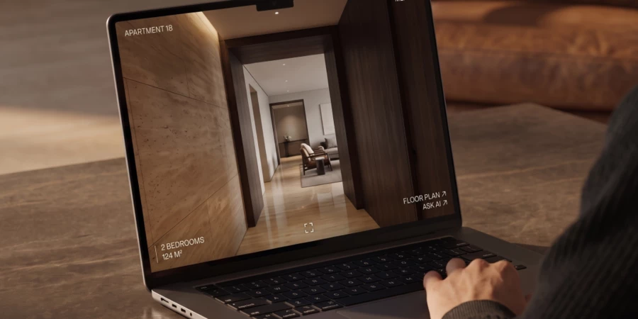
Some of the content isn't just for browsing before a visit — it's built to be used in the room, during the consultation itself. At the doctor's request, we created pages he can pull up live, walking patients through implant types and what to actually expect.
In the most literal sense, this site became a tool the doctor actually uses — refined, deliberate, exact down to the smallest detail.
Content and production. Consistency is what builds trust
A design is only as strong as the content inside it. So when the work calls for it, we don't limit ourselves to what our own team can produce in-house — we bring in outside production partners when the project needs them.
For this site, we selected visual references and planned the entire production — right down to recommending a modeling agency. People who know how to capture someone at their absolute best helped us make sure every photo matched the aesthetic we'd already built. Those expressive hands you keep seeing throughout the site — they're the surgeon's own, shot exactly to the references we gave him.
This is the difference between digital branding done properly and a layout filled in with stock decisions: design, copy, and imagery all pulling in the same direction, as one thing. A plastic surgeon's site has zero room for error here — the smallest sloppy detail reads, instantly, as sloppiness in the surgeon's work. Trust this size is built out of details this small.
A site, beautiful because it's precise
In plastic surgery, beauty comes from precision — a steady hand, a calculated decision. We built this site the same way. Every section quiets a specific fear. Every visual choice earns a little more trust. Beauty, refined to its sharpest point, is what defines this doctor's work — and it runs straight through everything we built for him.
That's really what every project comes down to for us. We're not adding shine to the surface, and we're not manufacturing beauty out of nothing — we're finding what's genuinely valuable in a project, pulling it fully into the light, and making it impossible to look away from. In a way, that's not so different from what a surgeon does: find what's already there, and give it its truest shape.
Get the edge with award-winning design and development for your website!