
The Art of Getting Noticed: Product Design and Development for an Artist Social Network Startup
View CaseVide Infra — product design and development company, working with clients around the world. We help enterprises and startups turn an idea into a winning product — from strategy and visual communication to product design, development, and launch. This design case study is about how we helped Follow.art create a professional platform and attract attention to it. A promotional website and SaaS platform for artists and curators.
Attention is rare. In a world where there is an endless amount of content, the opportunity to be noticed is worth its weight in gold. For artists, this is not a metaphor. It's what they wake up to every day: you put love, time, and meaning into your work — and it drowns in endless streams of content and machine algorithms. Not because it's weak, but because that's how the system works.
When Follow.art approached us with their startup idea, we immediately recognized its scale. Not only in terms of technical execution but also in its potential to help creative people realize their full potential.
The Problem of the Target Audience
In the art world, connections are everything. But for most artists and curators, these connections are complicated by galleries, institutions, and social media algorithms. It is not the authors themselves who decide who will be noticed and who will not.
Follow.art is an early-stage startup created by people in the arts who are tired of a system where visibility depends on algorithms rather than talent. This is a classic problem in the creative industry: social networks are geared toward the reach and engagement of entertainment content, not professional context. Other industry platforms start out as spaces for creative people, but as they grow, they inevitably become mainstream — and end up reproducing what they promised to eliminate.
The team wanted to build a social network for artists where professional context is more important than reach. Not competition, but community — that's the philosophy behind the project.
Product Strategy and Startup Idea
The client approached us with the idea of creating a social network for the art community. For a design agency for startups, this is a familiar starting point: not a ready-made technical assignment, but a vision that needs to be turned into a finished product. We started with immersion — a series of sessions with the team that helped us understand the audience, the competitive landscape, and brand positioning. All of this formed the basis — from the product structure to the tone of communication.
The client wanted to implement many things at once. Using an agile design process, we helped set priorities: forming a clear product roadmap and a minimum set of features for rapid MVP development — to get real users as early as possible and rely on their feedback rather than hypotheses.
The go-to-market strategy became one of the key decisions on the project. As a first step, we developed a promotional website — a landing page for collecting early access applications, even before the full platform launched. This allowed us to test the product-market fit and build a base of early users before the official product launch.
Product’s Communication Design — Developing Tone of Voice
The Follow.art team already had a strong understanding of its audience and a clear voice — rebellious, direct, informal. Each message is aimed at a specific need: to be seen, to find like-minded people, to step out of the shadows. No pretentiousness or corporate politeness — just honest conversation with people who are tired of the system.
The task was broader than brand storytelling and brand identity design — we needed to find a visual language that resonates. This is the essence of strong digital branding: not drawing a logo, but building a feeling.
Brand Identity Design: The Visual Language of the Platform
Forming Product Identity
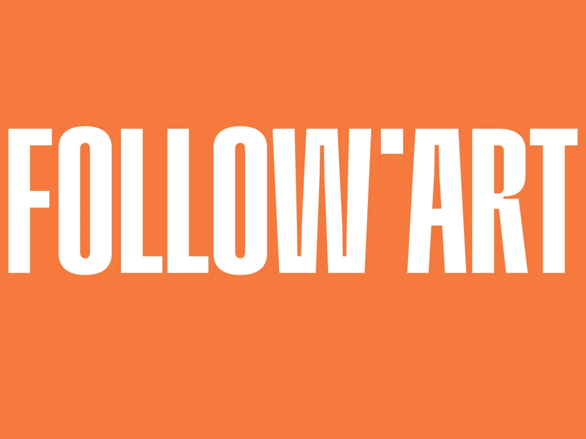
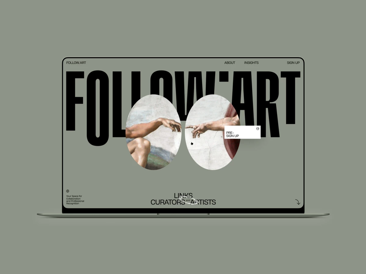
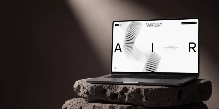
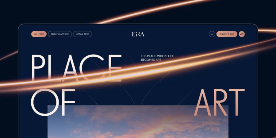
The visuals had to be read as “the world of art,” but without repeating its clichés. We consciously moved away from gallery minimalism — white walls, quiet fonts, muted tones. Follow.art has a different energy: loud kinetic typography, rich colors, and visual boldness. This is not just another “neat” art platform. It is a statement. A performance.
But visual boldness does not negate convenience — visual branding and usability must work in tandem. That's why the rebellious spirit doesn't scream in this project; it's elegantly embedded in its details: the dot is not at the bottom, but at the top — a deliberate violation of the rules. Stretched letters are a faux pas in typography, but why do you need other people's rules in a project steeped in freedom? The icons and decorative elements are a subtle nod to street graffiti — a place where creativity doesn't ask for permission. Even the product screenshots are curved rather than flat — an unconventional technique that serves as another reference to this character.
At the same time, when moving from the first concept to the final one, we consciously sacrificed some of the typographic expression in favor of text readability. The balance between boldness and convenience is one of the key decisions in the project.
Testing Hypotheses
At an early stage, we tested a concept based on the contrast between classic and modern. We looked for famous paintings with a double composition — two main characters — as a metaphor for the connection between curators and artists. Michelangelo's “The Creation of Adam,” works by Magritte, Brezhnev and Honecker's kiss on the Berlin Wall. Each image was reinterpreted in a modern way — deliberately provocative, with a touch of street art.
The concept solved two problems at once: it attracted attention and visually conveyed the main idea of the platform — connecting people. The client initially liked the concept, but after validation, they decided that it looked too provocative. The concept did not make it to the final stage, but it played an important role — it helped to find the necessary degree of freedom in the visual language. And much of it was transferred to the final design: the dynamics of the letters, colors, fonts, and overall feel.
Immersive 3D Web Experience with WebGL
Animation and interactive elements work to immerse the viewer — they help them better feel the project's ideas, rather than just read about them. At the same time, the technological side is not an end in itself: each effect adds uniqueness and depth to the project, reinforcing what is embedded in the visual language.
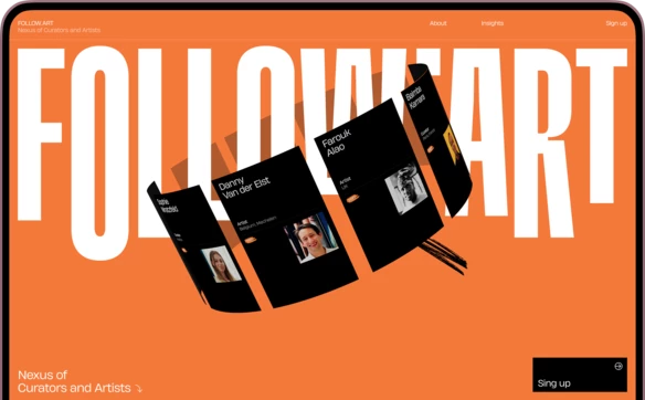
The central element of the main screen is the artists' profile cards, implemented using WebGL. Their rotation creates a feeling of a living community, rather than just a catalog of profiles.
WebGL is used actively, even where it is not obvious. Screenshots of the interface are curved in 3D, which adds volume and a sense of a living product rather than static images. Brush strokes instead of hover effects, blocks like album pages rather than ordinary sections — every detail works towards a single idea. All together, it creates an energy that doesn't just let you read — it draws you in, makes you feel, and makes you want to be a part of it.
Frontend development is built on Vue.js, 3D effects are implemented through WebGL, and the backend is on PHP and Symfony. This stack enabled us to achieve high performance and visual expressiveness simultaneously.
Full-Cycle Product Development: From UX Research to Platform Launch
The promo site is a bright entry point, but Follow.art's main product is a full-fledged social network for the art community. We went the whole way with the team: from the first hypothesis and UX research to development and launch — without passing the baton, but keeping all the reins in one hand.
The process was based on the principles of user-centered design and design thinking. We started with user research: user journey mapping, scenarios, and the Jobs-to-Be-Done framework — all of which helped us build a clear information architecture and understand what artists and curators need at every step. We conducted a UX audit of existing solutions on the market. Next came interface hypotheses, prototypes, and usability testing.
Design and SaaS platform development were not separated: each solution was immediately tested in a live product. From a multitude of options, we chose the most effective ones and brought that rebellious style to them — so that the platform would not only be convenient but also recognizable. The functionality is unique — we didn't copy existing social networks, but designed everything from scratch.
The platform brought together the most important features for artists: a digital business card, portfolio, professional catalog, blog, and forum. The client deliberately gave each element of the platform a unique name — not “artist list” but Connectory, not “profile card” but Nexus Card. This is branding for things that usually remain nameless.
The platform grew in stages — from basic registration and cards to a catalog, forum, and paid features. Each step was based on real user feedback — iterative product development at its finest.
Nexus Card
The core of the platform — Nexus Card — works as both a portfolio website for artists and a digital business card: it can be created in minutes, is easy to send, and works in wallet applications. At the same time, it doesn't look like a utilitarian card, but like something you want to share. The artist's work is in the foreground. Professional information is presented concisely, without unnecessary visual noise. The UX design is worked out at the level of each element — this is what makes Nexus Card not just a feature, but part of the artist's identity.

Each artist can style their card — upload a background, customize it to their liking. As a result, the cards are lively and unique. Even without customization, Nexus Card looks stylish — but when authors invest in the design, the card becomes a full reflection of their practice.
A separate feature is a QR code for donations. The artist generates it from their Nexus Card, prints it in a stylized template, and places it next to their work at the exhibition. Visitors stop at the work that catches their eye and can express their admiration not just with quiet admiration, but with action. The artist receives feedback in real time — and in real money.
The Connectory
Through the Nexus Card, the user enters The Connectory — a catalog of artists and curators with search and filter options. The task is simple: find the right person and write to them directly. This is one of the key scenarios — and it is in such details that the difference between effective digital product design and a simply beautiful interface becomes apparent: the filters are arranged according to parameters that are truly important to professionals — specialization, medium, location — everything a curator needs when searching for an artist for collaborations.
Artworks
A separate section of the platform where you can view the works of all artists in a row — without being tied to a specific profile. This allows curators and colleagues to find interesting works based on content rather than the author's name.
Community Board
Community Board is a forum for Connectory users. Posts, comments, and a separate “Let's Collaborate” format are easy ways to find a project partner.
Insights
Project blog. The Follow.art team publishes updates and articles here about why an open art community is important.
Paid Features
The platform offers advanced subscription features: profile statistics — how many people visited, how many times you were found in search, card promotion, and the ability to accept donations. Monetization is designed so that basic functionality remains available to everyone, while paid features help those who want to grow faster.
Mobile Version
Mobile-first design was a priority from the very beginning of development. The mobile version of the platform, with responsive design, completely replicates the functionality of the desktop: viewing cards, searching for people, and communicating — conveniently on the go. Integration with Apple Wallet and Google Wallet was one of the key ideas at the start — the ability to add your business card to your phone and always have it at hand
Product Launch & Results
Behind any specific project tasks, there is always a key meaning that cannot be overlooked. No one needs just a website, identity, or platform — it is important that they are useful and solve real problems for people. For Follow.art, this meaning was to bring artists and curators together under one digital roof, give them the opportunity to promote themselves and attract attention. That's why it's especially valuable to us that the project itself did not go unnoticed — it immediately received three Site of the Day awards from Awwwards, FWA, and CSSDA — a sign of recognition from the global design community. This alone attracted tens of thousands of people from the creative industry to the project.
The main risk of any new product is entering the world and finding that no one needs it. Our many years of experience working with early-stage startups helped minimize this risk: a well-thought-out product roadmap and packaging that meet the needs and tastes of the audience. The design resonates not only with the art world but also with the design community. User engagement is growing — the platform already has active users and paid subscriptions, and the product launch itself attracted tens of thousands of people through user acquisition channels.
The connections between artists and curators will only grow stronger. We are glad that this project has become not just a job, but a way to realize what is truly important to us: creative freedom, bringing people together, and the desire to help each other.
This case study is about how Vide Infra works when the entire project is carried out by one well-coordinated team. Most companies specialize in one thing: some make complex products but are not good at communication design, while others are the opposite. We don't divide things up like that, which is why each area strengthens the others. Follow.art is a living example of what this can achieve.
Client testimonial
Choosing Vide Infra was one of the best decisions we made while building FOLLOW.ART, and I say that as someone who's worked with a lot of teams. What sets them apart isn't just the quality of their work, it's HOW they work. Deadlines were respected, communication was transparent at every stage, and we always knew exactly where things stood.
No guesswork, no chasing updates, just a team that ran a tight, professional process from kickoff to launch.
But beyond execution, what genuinely impressed me was how deeply they engaged with our business. They didn't wait to be told what to do, they brought ideas, challenged our thinking constructively and treated our product goals as their own. That kind of proactivity is rare and invaluable. The outcome speaks for itself: a distinctive brand identity, a promo page that converts, and a product that users find refreshingly easy and enjoyable to use.
Vide Infra is a team we'd recommend without hesitation. And not just to startups finding their footing, but to any established brand looking for a reliable, thoughtful, full-cycle design and development partner that delivers on both craft and commitment.
About Vide Infra
Beauty is perceived as truth. If something looks flawless, it is trusted. Vide Infra is a design agency for startups and ambitious businesses. Since 1998, we have been helping companies build digital strategies and implement them through flawless communication, product, and UX/UI design and innovative technological development.
Get an award-winning website