
Your startup has the potential to be a game-changer. You and your team know it. But someone visiting your website for the first time — don’t. They have no context — and no real reason to trust you yet. They probably have a dozen similar websites open in the tabs. If you don’t grab their attention in the first few seconds, they'll leave. Not because your ideas are bad. But because you failed to present them properly.
At its core, every startup is a story about the future. A story about who you want to become. Your website is where that future first starts to feel real. It should show not just what the product does, but who you are — the passion with which you started your business and that keeps you going.
We've collected six of the best startup websites of the past nine months. Each one received Awwwards Site of the Day — one of the most prestigious awards in web design — and two are projects from our agency. But this article isn't about us. It's about what these startup website examples have in common: design that stands out, and sticks, from the first glance.
Technology You Can Feel
Three startups in this selection work with technologies that are difficult to explain and easy to make look boring. Clean energy, foodtech, climate tech — behind each lies science that is changing the world, but that most people still don’t fully understand. The goal of their websites is not only to impress, but also to make the invisible tangible.
Breakthrough Energy: How to Make a Grand Mission Tangible
When a company claims it will change humanity’s entire approach to energy, the first reaction is skepticism rather than inspiration. Such websites often fail to inspire trust because the scale of the promise is too vast to believe just by looking at a screen. Breakthrough Energy — a global platform for accelerating innovation in clean energy — is a different story. The Resn team found a way to demonstrate this.
Each scroll triggers a smooth animation, and this isn’t just a decorative touch — the animation guides the storytelling, from problem to solution, from the scale of the threat to specific technologies. Lots of breathing room, nothing superfluous. The accent color is used as a subtle touch, not a loud statement. As a result, a mission that might sound complex and abstract becomes clear — because it’s presented concisely, tastefully, and with a clear understanding of how people process information. Each screen gives you just enough to take in — and keeps you wanting to keep scrolling.
The global becomes personal. The invisible becomes concrete. That’s exactly how it should work.
Savor: When Science Needs to Sound Edible
30% of global emissions come from food production, a quarter of which are from fats and oils. Savor is taking on the responsibility of decarbonizing this segment by producing fats that are harmless to the planet and don’t compromise on taste. It sounds like science. But the challenge is to make it sound like food.
The Resn team struck the perfect balance. A large food photograph evokes an almost physical sensation of taste: oil, crust, golden textures—everything that makes the stomach react before the mind does. And next to it — animated diagrams that unfold as you scroll, explaining exactly how Savor produces its product. Science and pleasure on the same page — and they don’t clash.
One memorable detail: the logo in the footer behaves like melting butter in reverse. A small touch that conveys the essence of the product more accurately than any text. The transitions between sections are smooth and organic; the content seems to flow seamlessly from one to the next. The whole experience feels almost tactile. For a product that is still unfamiliar to people, this is exactly what breaks down the barrier.
Caeli Energie: a product like a hero that never lets you go for a second
Caeli Energie makes air conditioners. It sounds mundane — until you learn that their system consumes significantly less energy and drastically reduces the carbon footprint. Behind this simple product lies revolutionary technology and the ambition to transform an entire industry.
The Beaucoup team bet on the product itself — and it paid off. It appears on the first screen and keeps you hooked for three consecutive sections: first, an introduction — what it is; then, how it looks in an interior; and finally, an invitation to explore the details. Each subsequent screen offers a new angle, a new level of detail. You’re not scrolling through a website — you’re examining the product, just like in a showroom.
No sustainability clichés — no green leaves or blue planets. The minimalist branding mirrors the “purity” of the technology itself. This allows Caeli to be perceived not as a “green” startup, but as a tech company with a strong product. A choice in favor of concreteness — and it pays off.
What ties these three together is simple: they all solve the same problem — making invisible technology tangible. And none of them resort to oversimplification. Instead, they manage attention: the rhythm of presentation, visual metaphors, and the alternation of density and air. That is precisely how the complex becomes understandable.
Rethinking the Industry Through Design
The following three startups operate in sectors with established conventions: the art market, logistics, and infrastructure. None of them conformed to their industry’s rules — instead, they proposed new ones. And the website became a manifesto of this rethinking.
Follow.art: a platform where everyone's talent can be seen.
Follow.art is a social platform for artists and curators. A place where art world professionals find each other directly — without algorithms deciding for them who to showcase and who to hide. Unlike typical social networks, which are geared toward entertainment content, Follow.art is built around a professional context: portfolios, collaborations, and searches by specialization and technique.
From the very first seconds, the site makes it clear: this isn’t about neatness or gallery-like silence. Dynamic fonts, bold colors, and a daring composition. Rebellion is hidden in the details — dots aren’t where they’re supposed to be, letters are stretched in ways considered a typographic faux pas, and decorative elements evoke street graffiti. Together, it feels like a manifesto of freedom where creativity doesn’t ask for permission.
On the main screen are artist profile cards, implemented in WebGL, that rotate in a single orbit. This technique creates the sensation that there is a living connection between the cards — they don’t just hang in space, but exist in a shared environment, influencing one another.
This is one of those rare cases where the brand’s character and the product feel like a single entity — they’re inseparable — and that’s what makes the project so strong.

This captivating synergy of brand and product made its mark on the world — the Follow.Art website was honored with the professional Oscar of web design. Our art social network received the Webby, the highest international award in web design, in the category of Best Functional Design. Because deep aesthetic excellence is not just about looking impressive. A website is only beautiful when it solves real problems for the client.
Read the full Follow.art case study — designed by Vide Infra, a startup web design agency.
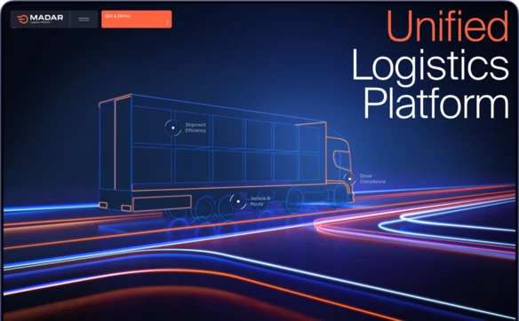
Madar: What Leadership in Its Category Looks Like
Madar automates freight transportation in Saudi Arabia and is preparing for international expansion. The audience consists of conservative corporate clients. The brief was a bit of a paradox: the website must be visually impressive while also being rationally convincing.
The key strategic decision was to avoid fighting on someone else’s turf. Instead of trying to compete with global logistics software giants, Madar created its own product category — with a new name, new positioning, and new rules. When you create a category, you set the rules.
Visually, this idea is expressed through 3D animation built around the concept of a path. Movement here works on three levels: as a recurring graphic motif, as a reference to the product’s essence — transportation and routes — and as a way to guide the user from the first encounter to concrete arguments. Multi-layered animated scenes draw you in from the very first screen, followed by the product, case studies, and statistics. Emotion transitions into rational conviction, and you don’t even notice where the line is drawn. Result: Site of the Day on Awwwards, CSSDA, and FWA. We know this firsthand — our team created this project.
Read the full Madar case study — created by Vide Infra.
Terminal Industries: a familiar object in a still-unfamiliar future
An ordinary cargo truck on the screen. You start scrolling — and it comes to life. You control it. And at that moment, a transformation happens: the familiar object dissolves into a high-tech visual world, into something that lies beyond the conventional understanding of logistics. In literally a single scroll — the journey from “this is about trucks” to “this is about the future.”
Terminal Industries is developing the Yard Operating System — a platform that transforms container yards from a bottleneck into the most efficient element of the supply chain. The teams at REJOUICE and Propagande found the perfect approach for this task. While Madar builds an immersive 3D world from the very first screen, Terminal takes a familiar object and transforms it right before your eyes.
The approach works because it’s driven by a vision: Terminal isn’t just optimizing the old — it’s reimagining the industry. And the website shows this literally: here’s the world you know, and here’s what it will become.
What these three projects have in common: each of them didn’t conform to their industry’s visual rules — they broke them. Rebellious graphics instead of gallery-style restraint, a new category instead of competing on someone else’s turf, the transformation of a familiar object into the technology of the future. Design here isn’t just decoration — it’s an act of reimagination.
6 Principles of Award-Winning Startup Website Design
Story Instead of a Feature List
Startups often try to show everything at once: features, technologies, benefits, integrations. But strong startup websites don’t start there. They start with a story — the problem the startup solves. A feature list answers the question “What do you do?” A story answers the question “Why do you exist?” The second question is more important — because an investor, partner, or first user must first understand “why,” and only then “how.”
Complex — clear, but not simplistic
Many startups work with technologies that cannot be explained in a single sentence. But that’s no reason to overload the site with jargon — and no reason to simplify it to the point of primitiveness. The best sites find a way to convey complexity through visual metaphors, animation, graphics, and a coherent narrative. The idea is simple: show, don’t tell.
Your own visual language instead of imitating corporations
A logical but flawed move is to take the visual language of an industry leader and adapt it to your own needs. This is a trap. What works for a company with a thirty-year history and a recognizable brand doesn’t work for a young team just entering the market. A corporate style on a startup’s website doesn’t inspire trust — it feels fake.
Visual language as character, not just design
Stopping the imitation is half the battle. The other half is finding a style that accurately reflects the essence of your specific startup. It doesn’t emerge from a mood board of trends. It grows out of the values of the team and the product’s audience. A startup that doesn’t understand itself won’t be able to express that visually. And the task of a design agency for startups is to first help find that understanding, and then translate it into a language that will be meaningful not only to you, but also to someone who has simply stumbled upon your website.
A future you can already feel
Every startup sells something that doesn’t yet exist. The hardest part is making that non-existent thing tangible. Through animation that you experience as you scroll. Through photography that evokes an emotional response. Through graphics where the product already works the way it will in five years. And here’s the key: the future must look like the future. If you promise innovation, the website cannot be built using yesterday’s tools. Modern design technologies are not a luxury but a necessity to make that promise look convincing.
Project Industry Key Approach
A startup often gets just one real shot at making an impression — and all six projects prove that this chance can be used brilliantly. Each of them sells the future — clean energy, freedom for artists, food without harm, logistics without chaos. And each makes that future so tangible that you want to invest in it—with time, money, and trust. It’s not about how many effects you use — it’s about how intentional each decision is.
A creative website for a startup is not a matter of taste or an expense item. It is a strategic tool that converts attention into trust. A generic landing page can deliver information — but it cannot convey the scale of ambition, the depth of thought, or the character of the team. This is precisely what distinguishes websites that attract investors and early users from those that merely exist.
Today, the question isn’t just about what your website should look like. The question is who you’re competing against. A startup competes for attention and trust not only within its own industry — it competes with all startups that are selling the idea of investing in them in exactly the same way. An investor who looked at Breakthrough Energy’s website this morning will open yours this afternoon. A user who saw Follow.art yesterday will compare it to yours today. The bar has been set—and it’s exactly as shown in this collection. Not getting left behind while selling the future — that’s what every startup faces.
Two of these projects — Follow.art and Madar — were created by our team. For a startup, choosing who builds the website is just as strategic a decision as choosing a market or a business model. This decision determines whether people will notice you or pass you by.
Check out our case studies and approach to work — award winning design agency.
FAQ
What should a startup website include?
A startup website must explain within the first few seconds what problem the product solves, who it's for, and why it deserves attention. Key elements include clear storytelling that leads from the problem to the solution; a visual language that reflects the brand's character; and concrete proof of value — whether through case studies, statistics, or a product demo. Navigation, loading speed, and mobile responsiveness are basic requirements without which everything else loses its meaning.
Why is startup website design important for attracting investment?
For an investor, the website is the first impression of the team. The quality of the design reflects the quality of thinking: if a startup can clearly and convincingly present itself through its website, it means it can think just as clearly about the product and the market. A website does not replace a pitch deck, but it sets the context in which the pitch is received — with trust or skepticism.
When is it time for a startup to invest in a professional website?
The ideal moment is when the product is sufficiently defined to be communicated, but before a large-scale market launch. In the early stages, a website can serve as a validation tool — a landing page for collecting applications that gauges interest before launch. During the fundraising stage, the website becomes critically important: it's the first thing an investor will open after the pitch deck. Putting off the website "until later" means wasting time during which it could be working for you. If you've reached this stage, it's worth working with a design agency that specializes in startups.
Get an award-winning website