
Digitalisation, and new methods for communicating and receiving information, have changed mobile network operators' market rules, and have shifted the focus of people and business from minutes to data plans. After the media industry, telecoms is the industry most affected by digitalisation.
But every crisis brings an opportunity for growth. This opportunity lies in digitising mobile network operators' services and customer workflows. These changes enable MNOs to offer additional services that lie outside the traditional telecoms service range boundaries.
The structure of telecoms has changed, as it has with UX. With more data available, it is possible to make visiting websites a more personalised experience. Still, creating a site like this requires thorough research, to see how today’s internet users perceive these telecoms transformations. To optimize the customer journey and achieve the desired results, new telecoms website UX hypotheses have to be confirmed and tested.
This article will show how we improved a mobile network operator’s website user experience design, explain our thoughts behind it, and highlight UX design best practices we discovered during the process. Enjoy!
How to approach mobile network operator website UX design
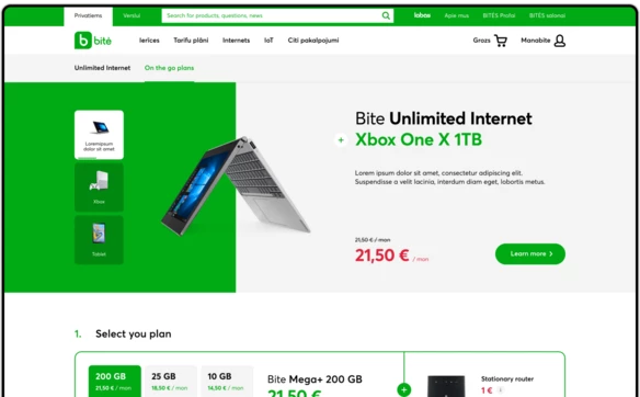
Bite, one of the largest MNOs in the Baltic states, approached us to redesign their existing corporate website to improve how their customers perceived and interacted with the key website modules: data plan and other service offerings, and a full-scale personal gadget eCommerce shop. The project resulted in better customer acquisition and conversion, a streamlined user experience for finding and selecting the right product, maximised purchases with easy-to-understand bundling with an optimal subscription plan, and an overall improved customer experience.
Heatmaps and user behaviour analysis for improving UX design of a telecoms website
We approached the task by carefully analysing how customers used the current website, what seemed to create obstacles for fulfilling their goals, and what missing features their behaviour might be implying. We used several user behaviour analysis tools to identify issues and opportunities for improvement. If we spotted that customers clicked on certain static page elements, or sections that may be interpreted as leading to more refined or linked information, we looked for ways to improve the user experience.
The heatmaps, scroll maps, and user mouse tracking allowed us to understand website usage and improve its functionality. For example, we understood that we had to enable the users to change product attributes, such as colours and other secondary characteristics, to alter the contract terms — all in the product cart. Also, the clicks heatmap helped us to identify the most popular sections of the product catalogue. The scrolling map helped us find issues on several pages — it became evident that most users didn’t scroll deep enough to see essential items located “under the fold” of the page. The mouse tracking assisted us in improving the mobile version of the plan selector page, giving additional insight, and helping us to hypothesise more elaborate solutions.
Finally, we shared our findings with the client’s team and in the course of several workshops, prioritised the improvement ideas by aligning them with the company’s business goals.
Using available eCommerce and telecoms UX research as a foundation for design
Another crucial part of developing an effective UX design was employing all the available eCommerce and Telecom UX research we could acquire. This allowed us to identify the best practices for certain website elements that third-party researchers have already tested. Additionally, it significantly enhanced the design process in terms of customer communication and UX testing, because we could provide research-grounded insight into questionable ideas. Finally, we shared our findings with the client’s team and in the course of several workshops, prioritised the improvement ideas by aligning them with the company’s business goals.
UX design improvements implementation
Product contract coupled with a data plan
A part of the MNO business model is contract gadgets and selling a discounted data plan on top. We focused on creating a highly intuitive and convenient user interface that serves this function especially well. The customer can therefore pick a contract term and even add extra services on top.

Streamlined homepage
We optimised the contents of the homepage by designing new, clickable banner formats with more information on them. We also increased the density of elements on the page – one screen now contains much more helpful information.
Website navigation
On-site search
The new on-site search looks up the keyword simultaneously in products, product categories, FAQ items, and website pages. We also made it more visible - in the previous version the user had to click on the search icon to open the field. In the new version, the input field is available from the start, increasing direct searches and overall conversions.
Client scope
The audience scope division is more visible in the new version: a scope for private clients and a scope for businesses is one of the first navigation elements the users see, which helps avoid client frustration.
Mega-menu
Bite is a large company with a lot of information on its website. Making access to the required website sections easier was one of our main tasks, and improving the main navigation menu was the key. We implemented a mega-menu that made access to the key parts of the website more intuitive, placing the gadget selection — one of the leading destinations on the website — literary one or two clicks away.
We tested two approaches when designing the mobile menu: the sequential menu and the accordeons. The sequential menu results in less cluttered views, yet put an extra cognitive load on the users as they have to keep in mind where they are located within the website structure. The accordeons allow users to have visual clues on their location, and hence are less demanding. This was the reason we kept the accordeons paradigm for the menu.
Product card
With the new design, we improved the product gallery the way the main and additional product characteristics were displayed. Added a block displaying bonuses and other gadgets bundled with the product and designed friendly controls to pick a colour, memory size and screen size for TVs.
The “Add to cart” block incorporates purchasing options, price options, and other details. This turned out to be convenient and functional, despite the information being very dense. It now includes a handy switch between contract and full payment, which eases purchasing decisions for the customer.
In the view that appears after the customer has added a product to the cart, we introduced an opportunity to upsell additional gadgets and tariff plans, and recommended some more products and accessories.
Developed mechanics of purchasing goods in a bundle.
When purchasing a smartwatch, we offer a unique plan with eSim.
Product list
We streamlined for the customers finding and selecting the products with a sorting and filtering mechanism and secondary search, which is available on the page. We improved how the product cards look, which significantly improved the page’s usability. We thought out a label system to promote specific product categories and features — product variations with bonuses and gifts included. We also provided all possible price options: contract, full payment, discounts, and carried out main characteristics into product cards in sensitive categories, like TVs and laptops.
A reworked product cart and reengineered checkout workflow
The original product cart had complicated mechanics, as some gadgets may have been available on contract, and some not. We created a clear visual separation between the two to make the interaction and experience more accessible and less confusing.
The product cart can store products from different categories simultaneously: those that may be purchased on contract, those that may only be paid for fully, and subscriptions for the data plans. During the checkout, we displayed the cart's contents in order, and showed product pricing nuances to make the final price more transparent and easy to digest for clients. The form’s breakdown to the steps allows to keep the process simple and edit data on already filled steps if required.
The product comparison allows the customers to quickly review the key differences among the products they like and decide which ones fit their requirements better. It removes the need to keep track of the product they want, usually realised as open browser tabs, and provides an easy way to collect the products in one view and analyse their main characteristics.
Improving UX design of MNO data plans selector through UX testing
The data plan selector is a crucial section on any MNO website, but it is often underrated and doesn’t receive enough attention. At best, it’s taken from a more prominent competitor’s website. At worst, it’s implemented without any particular care to make it intuitive, informative, and compelling. It could potentially lead to an awful user experience, frustration and apathy. Or even cause an extra load on a call centre and site abandonment.
With clever use of UX design and A/B testing, we can approach designing a data plan selector that will help customers quickly pick an offer that best fits their needs, inspiring and exposing special care the MNO projects to their clients.
This chapter will tell how we created UX hypotheses and tested the designed prototypes through massive UX research.
Developing data plan selector design
Many MNOs use a data plan representation that has become stereotypical. This means product cards where each option gets its small plate. The cards take up valuable space on the page, and don’t leave any opportunity for highlighting product details and making design in any way inspiring — there’s just no space for this. This is an example of a typical design pattern that doesn’t consider the customer’s perspective in full, is far from optimal and remains popular purely because of a copy-paste culture.
To find a solution for the B2C data plan selector design that answers the customers needs better and is more compelling, we tested several UX design hypotheses and prepared corresponding design options. We built the theories around some assumptions about the goals and contexts in which the customers would approach the product. The basis was to highlight the traffic volume indication, as it is the main anchor for customers’ attention due to predominantly sole internet use on their smartphones.
Desktop
Option 1 — Plans presented in tabs
With this option, we hypothesised that the critical elements of focus would be the data volume indicators and detailed description of each plan, presented with a promo look and feel, with illustrations and refined design. We assumed that the customers would more often than not go for a particular data volume, and would benefit from an inspiring presentation to validate their choice, rather than meticulously comparing the plans.
Option 2 — Plans presented in a table
With the second hypothesis, we assumed that fast and easy plan comparison would be the key. Rather than going for a particular plan right away, the customers would want to carefully compare the plans and go for the one that best fits their needs after careful and unemotional consideration.
Option 3 — Plans presented in a slider
Contrary to the second design option, here we assumed that entertainment and inspiration may be highlighted in the selector to achieve a more dynamic approach to the plan selection. The customers are offered almost a game-like design, where they use a slider to pick the required plan and enjoy a more colourful and elaborate design.
Mobile design options
Option 1 — Plans present as cards
The option to view the plans one by one with the general characteristics and without having to tap for the plan to expand it.
Option 2 — Plans presented in accordions
A compact option with an emphasis on the number of gigabytes included and the price. A quick comparison of the two main characteristics.
Option 3 — Plans presented in a slider
The option is made in more game mechanics, with a focus on description and design in a promo direction.
UX design testing
Desktop
Option 1 — Plans presented in tabs
Most testers (4 out of 5) preferred an option where plans are presented in tabs. The main points that attracted testers in this version are:
- Easy comparison of the most important differences of plans
- Large price and plan names
- Clear structure and composition of the plan
- Images for each plan
A few testimonials about this design:
- “Images looks professional and modern”
- “I like this design as well. It’s much cleaner design“
- “Images works well“
- “Very organized“
- “Has a lot of space“
- “Like interactive effects“
Option 2 — Plans presented in a table
Some testers found this version overloaded. Some testers wanted to see more images, and the table looked too technical for them. Some of the testers did not pay attention to the bonuses included in the plan. Nevertheless, for two testers, this option seemed like an easy way to compare plans.
Option 3 — Plans presented in a slider
A few testers didn't like the bright green background. They had difficulties processing the content with such a background. The testers noticed that the picture is smaller in this option. Testers noticed that it is more difficult to compare plans in this option due to a smaller plan change control.
Mobile
Option 1 — plans are in a slider
Most testers (4 out of 5) preferred the option where plans are in a slider. The main points that attracted testers to this version are:
- Easy comparison of plans
- No need to scroll the screen to grasp all information
- Clear structure and composition of the plans
- Images for each plan
A few testimonials about this design:
- “Much more clean interface”
- “My experience is absolutely brilliant“
Option 2 — plans present as cards
The testers had difficulties with this option. Some testers didn't understand which bonuses were included in the plan. The testers didn't like having to scroll so much to explore the plans. It was hard to compare the plans.
Option 3 — plans presented in accordions
In this case, some testers had difficulty comparing plans because they had to expose each plan. Some testers didn't understand what bonuses were included in the plan.
Conclusion
The difference between right and wrong MNO UX design may be counted in a tangible amount of unreceived profit, and decreased customer loyalty and satisfaction with the service. Even the most obvious telecoms UX solutions can be improved by deploying a proper UX design, to eliminate guesswork, increase conversions and effectively bring your business new customers. We hope that with the help of this article it is now easier to see how to approach the MNO website design projects, what parts of the website should be given special attention, how to pick the best design options available to make your online sales business soar.
Get the edge with award-winning design and development for your telecom website!

