
What Makes a Great Luxury Real Estate Website Design
A great real estate project should have a matching website to communicate all required information in style and needed tone of voice so that prospects understand the product's functional offerings and may feel the emotional brand values by interacting with the website. When designing the website, strive to reach for the following attributes:
Uniqueness
Ensure that the website's content, design and technical implementation revolves around a few key ideas that are essential to your product's communication and comprise the core of its positioning. Everything on the website should be tailored-made and directed towards conveying the main idea in a way that is specific to your product.
The best way to achieve it is by starting by developing a sound communication strategy: making sure the customer, competition, and product's unique functional and emotional attributes are well-known before the website design starts. These would allow the design team to develop great ideas that are effective only for your project and that make it stand apart from the competition.
Don't copy someone else's design but create one that resonates with the project's tone of voice and creates a matching emotional atmosphere. Your customers would appreciate the attention to detail and the strive to offer an authentic experience.
Usefulness
Strive to impress, but only after every functional goal your prospects may have when arriving onto the website has been met during the UX design and content development phases. The design that targets visual impression only would remain hollow and lifeless, no matter how elaborate. Put yourself into your customer's shoes and imagine every question, interest, and desire they may have and try to answer them by creating related content and features on the website. Think of creative ways to present it by developing sections like "24 hours at your project", "Taking a walk", and "Your unexpected neighbour" for presenting rich amenities, area around, or an excellent ecological situation by making an overview of flora and fauna in the area.
Make your prospects feel cared about and make them return to the website and find something they overlooked the last time. The more they are interested in the project, the more product details they will want to get and giving them a plethora of useful and well-designed information would help you to convey the sense of value.
Elegance
Aim at creating an elegant impression that communicates the product value. Don't oversell. Placing a prominent phone number or a giant and aggressive CTA right on the first screen won't result in receiving more leads. It impedes prospects from getting the desired impression of value and uniqueness. When thinking about crafting your message, mentally put money aside and strive to tell the most compelling story about the project and how your prospects would feel living there.
Advanced technical implementation
The website's technical implementation quality is an essential part of the creative solution. No matter how elaborate the design, it would never impress the prospect if it feels static and plain, like a PowerPoint presentation. Especially relevant for a project where the sense of modernity, technology and innovation are crucial but essential for all, the high-end technical implementation will make the website stand out from the competition. A subtle and elegant solution would suffice to achieve the effect, so look for ways to incorporate it into the design.
Award-winning luxury real estate websites
Poklonnaya 9 is a premium residential complex with a high-class hotel occupying the first floors. A vivid and bold — the project’s personality catches the eye at first sight and doesn’t lose grip on any page leaving no one indifferent. Rich interactive promo blocks and splendid visualisations help get into the project’s mood wholeheartedly. A story about lavish SO/ hotel integrates into the design organically.
Ever website design vividly demonstrates the key brand idea — a harmony of urbanism and nature, male and female, cold and warm. Browsing a rich and ever-changing homepage is as engaging as reading a top-notch fashionable magazine. You can't get enough of the exciting and beautiful project details presented with taste and elegance. Impressive 3D visualisations help make the design maximally enriched and diverse.
A rich and diversely designed real estate website allows the potential customer to dive into the project details and come up with a vision of her life there. That’s why creating one is among our main priorities.
The large and inspiring 3D renders together with large typography, carefully coupled with corporate colours create a rich and impressive effect, motivating the customer to interact with the website.
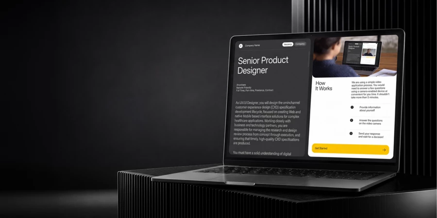
Victory Park Residences is an elite residential complex in the prestigious district adjacent to Victory Park. Besides the general presentation, the website features a few unique and original apartment selection tools. It allows the potential customer to narrow down the apartment choice not by reviewing the floor plans but by answering questions that target the customer’s life context and goals.
To facilitate a richer and more effective apartment selection in the sales office, we designed a special interactive presentation with real-time 3D elements.
Composition 24’s facade incorporates the forms from the famous Malevich futurist exhibition, thus paying homage to avant-garde in general. Our goal with the website design was to create a visual language that would be capable of conveying the project’s unique connection with the historic style, yet at the same time of making it accessible, exciting and commercially appealing to the prospective clients.
The avant-garde isn’t everyone’s cup of tea, and when working on a commercial project associated with the type of art, it’s highly important to balance the art’s true colors with satisfying the functional needs of clients who may not relate to it — so that both connoisseurs and regular people find it pleasing.
This is a neoclassical, Palladian building, and the prospective clients are high-net-worth individuals in their fifties, so we took the motives of everlasting values and timeless design — which appeal to this clientele and resonate with the project. We settled on the idea of long, story-like pages with contrasting design and superb content to achieve the look and feel of a highly polished and elaborate product. The final subtle — yet very effective — addition was the website’s intro: a WebGL animation showing the building literally composed of stars morphing into a 3D render.
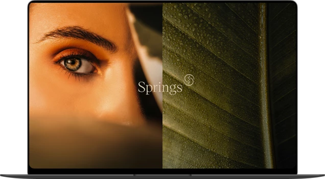
Jayasom is an ultra-luxury international wellness company that provides holistic treatments to the exclusive clientele in the top-grade hotels around the world. Our goal was to design a high-class website that promotes Jayasom to potential partners, resorts and investors.
Jayasom uses a holistic approach to help its clients evoke their natural beauty, health and potential. We depicted that using images of the subtle beauty of nature and transforming them with the user’s interaction into people’s silhouettes. As a result, natural beauty becomes an inner part of Jayasom’s people — this was the communication concept.
Rich history, authentic design, and the perfect location of the building speak for themselves. Rather than exaggerating luxury and exclusivity to grotesque levels - one way that all its competitors take — House at Klhebny required subtle, elegant and elaborate communication. A series of fine-art watercolour illustrations of the project's highlights, immersive content, and a technologically advanced website did the work.
Find a balance in your life! Level Barvikha Residence offers balanced living in a comfort of a city apartment surrounded by a natural landscape. We've designed a complete brand framework of name, visual identity, and promo material guidelines. Also, we developed a stylish print brochure, realistic visualisation of the building and surroundings, and a stunning website.
Technologically and visually advanced website for the modern loft project. To communicate Loftec's technological personality, we've developed an understated and minimalistic visual language focused on functional features and rich content. To emphasize the product's techno look and feel, we've turned to the cutting-edge front-end implementation, including a WebGL-based brand core presentation on the home page. The website offers elaborate and extensive content about the building, location, room design, and commercial offers.
Neva Towers is an outstanding premium-class apartment project in real estate market. Breathtaking views, private park with a panoramic pool, spa, fitness center, private cinema, squash courts and more. The website highlights the unique concept, architecture, location and infrastructure to put this project on the same level as the most luxurious residences of New York, Miami, Dubai and London.
Communication strategy
Any luxury product means something beyond useful attributes; it has one or several intangible qualities that make it especially desirable. These qualities serve to signify a social status or group belonging, an exclusive lifestyle and high aesthetics, a superior product quality, or tradition and heritage.
Possessing a product with these attributes allows the owner to transcend their personality and feel like something greater, at least for a brief period of time. Essentially, people buy emotions, and the emotion of personal transcendence is at the pinnacle of the hierarchy of desires.
The main task when developing a luxury real estate website is to identify, expand on and communicate these attributes with a maximum effect. Here are a few tips on how to do it.
Researching product attributes
To fully understand the product’s attributes, speak with the key people on the product’s team and important external people — in our case, the building’s architects and designers. The product’s technical, development, sales and marketing teams can provide a comprehensive overview of its functional and emotional attributes, ranging from its location to the peculiarities of the construction.
The architects and the interior designers may be a source of additional insight into more nuanced matters, such as the history of the location or the reasons behind certain aesthetic or functional decisions. They usually do their own research, approach the product’s design from a wider perspective than developers, and possess a rich historic and aesthetic background. Talking to them is always a good idea, and filming an interview an even better one.
By the end of your research you will be equipped with a wide spectrum of information on everything about the project:
-
Location
Social infrastructure around, transport and connectivity, ecology and recreation, history and future development plans -
Functional insight into the building
Amenities, technical design facts, adjacent territory, security -
Architecture and design
Facade and common spaces design, background of the aesthetic and functional design -
Apartments
Layouts, views, design and finishing options
Selecting the right product attributes
The more your product communication resonates with what your potential buyers hold dear, the more effective it will be. This is why understanding your clients is essential. Depending on their age, cultural and social background you may be able to derive how buying a new apartment or a house fits their life context, what drives their decision, how they envision their life in their new home. Having this insight will enable you to highlight the most appropriate product attributes in your communication.
Building a story
Product attributes alone rarely inspire prospective buyers, as they don’t convey emotions. Inspiration comes with a sense of a lifestyle, eliteness, craftsmanship, tradition, or anything else that may resonate with your clients. These ideas, by their very nature, can’t be communicated on a rational level; they require a compelling story that speaks to them on a subconscious level.
The key to creating a product’s story is forging a single strong idea that goes above and beyond the realm of rational product attributes, yet is directly connected to them, and represents an idea from the apex of your potential buyer’s desires and goals.
To arrive at the idea for your product’s story, distill the functional product attributes into a larger emotional essence; something that your potential buyers may take as a final subliminal push to acquire the property. A strong emotional story is the ignition key for all the communication parts to come together and create a cohesive and impactful impression. It adds the necessary depth to the communication and creates a sense of exceptional value, by alluding to larger ideals that potential buyers will want to transcend into.
After arriving at a solid story idea, present the product attributes in light of the story by finding their analogues in the story’s language. Thus, the infrastructure becomes craftsmanship, architecture and design — beauty or personal realisation, surroundings — care for your family’s future and wellbeing.
To be heard and remembered, your message should be original, and not mirror those of your competitors. Study the competition and outline their key brand messages, as well as their strong and weak points. When building your story, pick the ideas that are the most relevant for your potential buyers, among those which haven’t yet been used by your rivals.
Developing the visual design language
The goal of visual design is to help convey the right message to potential buyers, and differentiate your product from the competitors. It wraps information into a rich emotional package, and helps the customers understand and remember the key differences between products. It makes sense to develop a design that:
Resonates with the potential customers
Older clientele gravitate towards a more classical style, and design elements that traditionally represent luxury. Younger customers are more appreciative of new and innovative ideas, dynamism and fun. For a mixed audience a middle line would be appropriate.
Matches the tone of the selected product attributes and the product’s story
Older clientele gravitate towards a more classical style, and design elements that traditionally represent luxury. Younger customers are more appreciative of new and innovative ideas, dynamism and fun. For a mixed audience a middle line would be appropriate.
Stands out from the competition
The website’s colours, tone, and other features should differentiate it from its competitors, and help potential customers to easily remember it. If your website copies another site, then customers may have difficulty remembering the product, or may confuse it with something else.
Don’t allow cliches
Don’t fall for minimalism
Minimalist design has become the lingua franca of luxury communication. In too many cases, however, there’s very little substance, ideas or reason behind the form. Less is more when the content of the message is of the utmost quality, comprehensive, and inspiring in a way that there’s just nothing else to add. In other cases it just makes the communication dull and uninspiring. Sometimes the drive for reduction is taken to absurd levels, with UX just thrown out of the window.
Design by first principles
Base your design on solid research. Build gradually from the product’s attributes, to the story, to the visual design. This will make every part of the communication contribute organically to a bigger message, that will be greater than the sum of its parts. Copying the text from one website, visual style from the second, and features from the third will greatly harm your message — you may like them, but this approach will make your communication look inconsistent and untrustworthy.
Dare to be original
Your potential clients are bombarded with almost identical messages and designs. If your message is just like the rest you risk being lost in the noise. Emotional, relevant and genuinely valuable messages can be picked out and remembered much more easily.
Here are a few examples of “minimalistic” and “expensive” real estate project website designs with no unique story or style. Remove the logos and they will look and feel virtually identical, template-based.
Sites used: The Columbus Building, 25 Churchill Place, Aristo, Hello Brooklyn
Best practices in creating website content for premium residential real estate
Some themes and points that will add value to your website:
Location
-
Transportation and accessibility
Easy and quick ways to get to the important points in the city, information about building access routes. -
Ecology
Lack of industrial buildings, abundance of parks, air quality. -
History
Information about any historic places, people or events. -
Social infrastructure
Schools, health, shopping, etc.
Design
-
Architecture
Information about the architectural style and its roots, facades, materials and technologies, BIM design, etc. -
Common space design
Lobby, parking and other shared premises design details. -
Apartment interior design
Presentation of available styles and finishes. -
Inner territory design
Presentation of the available features and design.
Infrastructure
-
In the building
Colourful presentation of services, entertainment, sports, health and wellbeing facilities in the building. -
In close proximity
A map with selected social infrastructure points around the project with short descriptions and photos.
Benefits
-
Common spaces functional offerings
Like pram spaces or pet baths. -
Apartment features
Any remarkable functional or technical details, like panoramic windows, high ceilings, smart home equipment, etc. -
Parking features
-
Building engineers details
Gallery
A collection of images used on the website, grouped into categories for easy access: interior, exterior, apartments, views from the apartments. The views from the apartments could be broken down by floor (or number of floors for high-rises).
Apartment selection
-
Parametric search
Filter apartments by space, number of rooms, floor, price, and any special amenities they may have. -
Visual selection
Find an apartment by selecting a floor on a building’s facade, then by selecting an apartment on a floor plan. To facilitate the selection, show number of available apartments when hovering over a floor. -
Wizards
Allow the client to find a desired apartment by asking a series of questions about their preferences. -
Apartment page
Besides the apartment plans, which should be stripped of unnecessary technical information and created in the brand’s visual style, this page may contain information on any special details. finishing options, views from the windows, links to financing information, as well as a selection of similar apartments. -
Add to favourites
A kind or a wishlist folder where the client can save apartments that they liked. -
Printable plans
Make sure to offer downloadable high-quality apartment plans, with all the relevant information.
Showroom ideas
For a touchscreen in a showroom, It makes sense to create a slimmer version of the website, designed to go along with the sales manager’s presentation. Apartment selection on this kind of website can be structured from the sales manager’s perspective, allowing them to easily arrive at apartment types that may be of interest to the particular client. It could start with layout / room selection, then orientation, floor etc, essentially working like a wizard.
Victory Park Residences touch panel presentation made by Vide Infra

to have all the tips at hand
Get the edge with award-winning design and development for your real estate project!