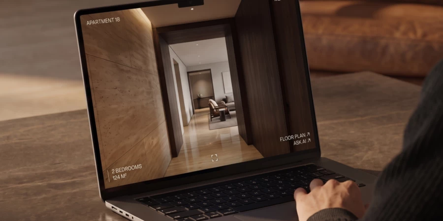
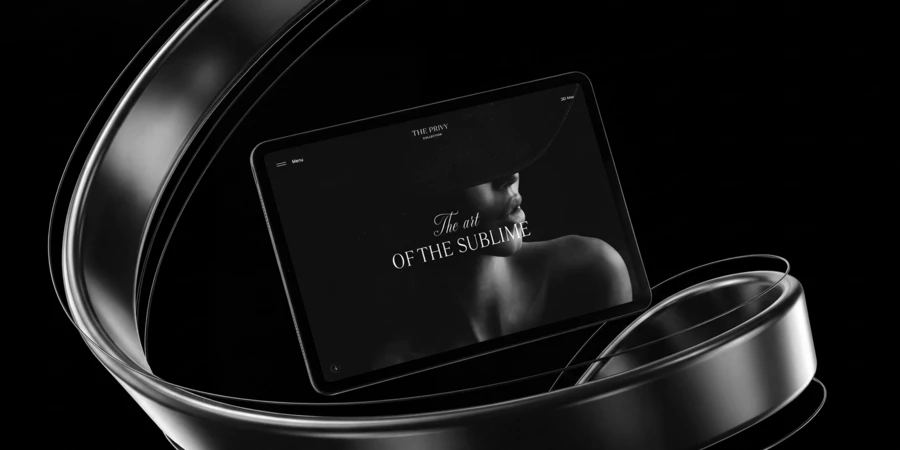
A cheap site is a stack of blocks. An expensive one is directed like a film. A good site has a clear structure, loads fast, navigates intuitively, and looks clean. Nobody argues with that, and at a basic level, it's enough. But in the premium tier, where everyone already has all of that, the real question is different: what actually makes a website look expensive, rather than merely look like it's trying to? That's what luxury website design actually comes down to: strategy, copy, design, motion, and execution all answering to one single idea — not the volume of effects stacked on top of it. It's direction — the decisions about what gets cut, and how everything that remains holds together as one impression. The difference registers in seconds — before a person has even worked out what they felt.
This is where the common misconception around expensive website design lives: the idea that an expensive site needs as much of everything as possible. More 3D, more animation, more effects on every screen. The truth runs the opposite way. When every block is trying to impress on its own, you don't get one impression — you get a scattered pile of attractions. A well-directed site has nothing extra in it.
So how does this direction actually work, and why is it precisely what separates high end web design from merely well-executed work?
Luxury Website Design Starts With Strategy
Direction starts long before the first screen is drawn. That's the first sign of serious work — even though it's invisible in the final mockup.
The common approach is to grab a generic grid, a template, and fill it with the client's content: an image here, a headline there, a button in this spot. Serious work is built differently. It starts with strategy and a communication idea — what the site is actually built on, what it needs to say, and to whom. That idea gets written into copy with two jobs at once: the pragmatic one (what needs to be communicated) and the artistic one (how it needs to sound). Design grows out of that finished copy — out of its meaning and its tone. In effect, this stage writes the script the whole visual sequence will follow: what a person sees, in what order, and what they're meant to feel at each step.
It's also where art direction begins, because there's nothing to direct without it. A pile of blocks stays a pile of blocks — pretty, but disconnected. When design grows from one single idea, it comes out whole by definition. We covered this in more detail in our article on digital branding.
On the AIR business center site, wide letter-spacing and translucent interface panels give the layout a sense of air — the composition built around lightness rather than added onto it.
A Director Cuts What Doesn't Serve the Whole
A director's real job isn't adding — it's removing. Filmmaking has a name for this: "kill your darlings." Even the most striking scene gets cut if it doesn't serve the film as a whole. Design runs on the same law: anything that doesn't serve the overall idea gets cut, no matter how good it looks on its own. That's exactly why an expensive site feels restrained rather than overloaded. Three places make this especially clear.
Animation in High-End Web Design: Smoothness Over Spectacle
The most common misconception about animation is that it exists to highlight elements and impress. Its real job is quieter and more important: making the whole experience feel smooth and continuous, without jolts or breaks. The best animation is the kind you don't notice — it never calls attention to itself, it simply feels natural.
At one extreme sit sites with no real sense of flow at all, where the rhythm feels choppy. At the other sit sites drowning in animation for its own sake — excessive, and unnecessary for the visitor. Both come from the same failure: poor art direction, the kind that turns a scroll animation website into something busy rather than something premium.
There's also a cost consideration here, because any animation demands real production effort — which makes this partly an economic decision too. High-end doesn't mean animating everything possible. It means making sure an expensive resource is actually carrying the story.
On the Ever residential complex site, smooth animations create a seamless journey through the whole experience.
3D Website Design: Balancing Impact and Device Performance
3D graphics are the clearest example of this, and here too there are two extremes. An agency may simply lack the skill to build 3D well. Or, the opposite happens — designers pour so much into it that nothing's left for anything else.
The difficulty is that the web is hard-capped by device resources. An overloaded scene makes the very 3D experience it was built for feel flat and unconvincing. Holding the balance means weighing two things honestly: what devices can actually render without visible loss, and what the project's economics can support. Will a phone have enough memory to run heavy scenes smoothly? Is the investment of hours actually justified by the result?
Choosing a vendor deserves particular care here. If an agency has no relevant case studies for this specific kind of work, it's effectively R&D for them — and that's worth naming upfront. The terms should be set in advance: who's responsible, and at whose cost, if the required quality doesn't come together. That caution isn't excessive. 3D usually anchors a site's key elements, and a failure there can undercut the whole project.
On the Silver Pinewood Residences site, a statue of Zeus comes to life through 3D and WebGL — a detail that carries atmosphere without weighing the scene down.
Composition: The Cheapest Route to a Premium Impression
Clients often arrive with rich, strong material already in hand — great photography, polished visuals. Luxury real estate website design and hospitality projects are where this shows up most: the photography is often commissioned before the site is even scoped. There's a common belief that content is everything, that everything else follows from it — and that's hard to argue with. But it doesn't follow that a designer's job is simply to take beautiful images and arrange them neatly across the screens
Between "there's good content" and "the content is genuinely well used" sits composition — one of design's most powerful tools, and the place where visual hierarchy is actually decided. A layered composition, for instance, deepens meaning and pulls a visitor further in. Another technique: letting an image stop being decoration and become the screen's actual foundation — the main layer everything else sits on.
There's a budget angle worth naming too: compositional design works powerfully for impression while asking almost nothing in return, in development or in device performance. It's the rare case where "looks expensive" and "cheap to produce" aren't in tension. A strong frame depends far more on a designer's craft than on budget.

Bringing Every Decision Together Into One Story
Cutting what's unnecessary is half the job. The other half — the half that actually separates high-end from merely competent execution — is pulling what remains into a single whole, so a person experiences the site as one continuous story rather than a plotless string of screens.
Every detail on the Springs residences site holds one tone — a meditative atmosphere built around restoration and calm, where nothing breaks the mood.
Directing a Site Has an Interactive Layer
The metaphor of direction might sound like an overstatement applied to an art director's work. But it holds — with one real difference. A film director builds an exact sequence of shots, and the audience receives it in that fixed order. On a site, the order is largely set by the visitor themselves: they choose where to go, what to click, what to skip. Direction here gains an extra layer on top of the usual ones — an interactive layer. Instead of one path, a designer has to account for many, and build a response to every possible action. This layer is especially sensitive: the interface's response can either deepen an impression or shatter it entirely. A designer has to hold not one viewer's journey in mind, but many possible ones at once.
The gallery on the Zorge 9 site responds as the visitor moves through it — the interactive layer turning a set of images into something you navigate, not just view.
Storytelling and Scroll Rhythm in Premium Web Design
Good website storytelling is the thread that leads a visitor through a site and holds their attention. It's not beauty for beauty's sake — it has a genuinely practical job: keep a person from losing interest and leaving, and carry them from the first screen to the action that matters. At the same time, that same thread carries the style — it's what makes a brand sound whole, rather than scattering into pretty, disconnected fragments.
Attention holds the way it does in film — through rhythm. A film alternates close-ups and wide shots, fast scenes and slow ones. A site does the same, alternating dense, saturated screens with calm, "breathing" ones — the mechanic underneath scrollytelling. Monotony puts people to sleep — a site built from identical blocks wears a visitor down the same way a film shot in one unbroken take would. A well-built scroll rhythm keeps someone moving forward, never bored, never worn out.
Cohesion doesn't appear on its own. It's defined by roles. A designer pulls text and visuals into a single story — effectively directing it, deciding what a person sees and feels, and in what order. An art director makes sure every element and idea stays true to the design concept set out from the start, so nothing drifts apart. Holding to one shared set of rules is exactly what produces that cohesion.
And cohesion impresses far more than any single, flawlessly executed block ever could. This is where most agencies that fail to reach the highest tier actually stumble. They can build strong 3D, striking animation, individually impressive screens — but they can't assemble any of it into one whole picture.
Website storytelling on the Dr. Grigoriak site borrows a magazine's editorial rhythm — pacing the scroll like spreads so attention carries from screen to screen.
Details That Make an Immersive Website Feel Alive
A cohesive design decides not just what a person sees, but the atmosphere they see it in. A clear example: 3D maps. Music gets layered in. Cars move through the city, creating a sense of life — while traffic itself is rendered as simple glowing points. That solution works on two levels at once: as a metaphor for the city's energy, and as a way to dramatically lighten the model's resource load. Passing clouds, birds overhead — all of it deepens the atmosphere.
What's true of that one scene is true of immersive website design overall: what makes it feel alive isn't complexity. It's the precision of the details chosen. And each one only works if it's tied to everything else — the moment a single detail breaks tone, the atmosphere dissolves. That's direction operating at the level of small things that turn out to matter enormously.
A 3D district map on the Era project.
Where Luxury Web Design Meets Usability
Direction has a boundary that trips up even those who've mastered everything else. Staging, atmosphere, and impression only work when the user experience stays legible. The interface has to remain simple and clear. Audiences are long used to ease online, and any confusing decision creates instant friction — and friction breaks the spell.
A designer has to hold the balance in mind: the emotional layer shouldn't dominate to the point where a person has to fight through beauty to reach the substance. They came to accomplish something — choose, understand, buy — not just to admire the site. Balancing emotion and usability isn't a separate rule; it's part of the same direction. Everything exists to carry the visitor to the finish line, not to leave them lost in the view, having forgotten why they came.
A visual selector on the Era project.
The Result: The Effect of Genuinely Skilled Direction
A cheap site falls apart into pieces — one striking block, then another, with emptiness in between. An expensive site leaves the impression that something intentional stands behind all of it. A director cuts what's unnecessary at every layer — in the animation, in the 3D, in the composition — and pulls what remains into one finished work. And underneath it all sits the strategy that makes this whole narrative possible in the first place, one that serves the result, not just the impression.
That's exactly why a genuinely expensive site can't be assembled from someone else's template, and can't be built halfway. High-end web design is a staging where every action, every scene reveals a single idea — and it's this, in the end, that separates a genuinely expensive site from one that's only trying to look expensive.
Frequently Asked Questions
What is luxury website design? Luxury website design is the practice of building a site where strategy, copy, design, motion, and technical execution all answer to one communication idea. It's defined by direction rather than by the volume of effects: what gets cut matters as much as what gets built, and the result reads as one continuous impression rather than a sequence of separate screens.
What makes a site good? At a basic level: clear structure, fast load times, intuitive navigation, and clean, current design. But that's the hygiene minimum — everyone has it, so it no longer differentiates anything. At the premium level, a good site is directed work, where content, design, animation, and technical execution come together into one impression rather than sitting side by side.
What makes a website look expensive? Three things matter most: cohesion (every element answers to one idea rather than existing in isolation), restraint (nothing extra — only what serves the impression), and a strategic foundation (the site is built around a clear idea, not a set of fashionable tricks). Individual strengths — strong graphics, striking animation — are secondary if they never come together into one whole picture.
Why do premium websites feel more trustworthy? Trust forms before a single word is read — it comes from the overall sense of quality. That sense comes from cohesion itself: one visual language, flawless interface behavior, no false notes. A fragmented site reads as unreliable on a subconscious level, no matter how expensive any individual screen looks.
Does "expensive" mean a lot of 3D and animation? No. An excess of effects often signals the absence of direction. A good site uses exactly as much 3D, animation, and interactivity as the story needs — and cuts everything that exists purely for its own sake.
What matters more — content or design? Both, and framing it as a choice misses the point. Even strong content underperforms if the images are simply placed on the screens. A designer's job is to build composition and narrative out of that content — that's what turns good material into a good site.