
Ask any fashionista if there is a difference between a jacket that costs $200 and one that costs $3000 and you will hear a resounding “YES!” High-end and luxury brands know that a person who buys a $200 jacket is not the same kind of person who chooses a $3000 jacket. More often than not they have different motivations.
The shopping experience for both jackets will be quite different too: You can buy a $200 jacket at almost any store. The customer service you will get will be a common one — no one is going to offer you a tea or a coffee. The store will look like many others. You’ll see many other jackets lying around, and will probably be searching for one on a rack. The store cannot afford to waste precious space, after all.
On the other hand, look at the offline retail experience of buying a $3000 jacket… The store is likely to be designed much better than average. Every detail is carefully thought out. Every product is a star, and each jacket has its own space devoted to it. Items are carefully ordered, and may be tailored to the shopper’s tastes. Often the brand will carefully choose music, aromas and textures to evoke certain feelings and emotions in the shopper, and put them in the perfect mood to buy.
Even the experience of owning the item itself is different. One will be used as daily wear, serving a fashionable yet mainly utilitarian purpose. The other is meant to create a style statement. It’s a status symbol, and its owners will give it the care that status demands.
This brings us to an important question. If the client type is completely different for each product; if the retail shopping experience is different, and even the ownership experience is different… why, then, are the eCommerce experiences of contrasting brands — the low-end, mid-tier, and high-end — so similar? Why are very different customers being treated the same across eCommerce websites?
Luxury eCommerce design: best practices
In the following section we present the best practices to use in a luxury eCommerce shop design, be it UX or UI, and explain why they should be implemented in the design of your luxury eCommerce website.
Homepage
The main page of a luxury eCommerce shop is like the lobby of a real one. The brand’s philosophy and attention to detail should infuse the design of the homepage. Instead of a champagne glass, you get a “wow” feeling. Also, as you stand there, gasping, you should understand where to go next — because there are no assistants around.
Display all types of products you sell on your homepage
For D2C (direct-to-consumer) and other websites with small catalogues, the inability to show the site’s product variety can result in the user misinterpreting its contents, which makes it more difficult for them to understand the product catalogue.
Solution: Feature a diverse sample of products on the homepage. Websites with a small catalogue should show at least 50% of this catalogue on the homepage, and not less than one product for each product type. In mobile versions you can use text instead of - or together with - images and thumbnails.

Dolce & Gabbana homepage presenting all kinds of products as a highlights slider
Have supporting pages about your brand and product attributes
Many users want to “feel good” shopping at a particular site, but the basic information about the brand they are looking for can be hard to find, or too short to evoke this feeling.
Solution: Create 2-5 pages dedicated to your brand’s story and principles, and the unique characteristics of the products.
"About the brand" page on the Amaffi website expands on the background of the perfume house
Include all navigation categories on the homepage
In some industries, category browsing generally performs better than other product-finding strategies, yet users are not motivated enough to adopt this strategy on the homepage
Solution: If category browsing is a particularly desirable product-finding strategy in your industry, consider representing the main navigation, important subcategories or both as part of the homepage content.
Fendi website provides main category navigation opportunities together with the latest collections
Emphasize main product and brand features on the homepage
Users are quick to evaluate not only a site’s product catalogue, but also the brand’s policies, value proposition, and trustworthiness. They can see all that right from the homepage and, if any of the above points lack clarity, it may result in premature abandonment of the site.
Solution: Sum up and highlight the core product and brand features on the homepage, including key product details and attributes, availability of free shipping, and information about the return policy.
This promo block on the Amaffi website gives users a feeling of the product quality and translates into trust
Images
In luxury eCommerce, photos make or break the sale. It is the only way a user can interact with the product and assess it. Good photos give a visitor the right first impression and help you shape your brand image in the customer’s mind. It is necessary to approach them with due understanding, because they are the key to the story your brand tells.
Invest in bespoke imagery and design
First-time users mostly judge the site and brand by the first impression, and tend to stick to that initial feeling throughout their shopping session. A negative impression translates to less patience with the website’s flaws and more abandonments.
Solution: Use bespoke imagery and design, but be careful using highly stylized and unconventional designs.
Custom high-quality photos of Amaffi products create a luxurious brand image and show Amafi`s attention to detail
Ensure the default product image is enticing and visually rich
Users’ impressions of the product are generally affected by the first picture they see. It might be the only image of it they see and it is easy for the default image to mislead or turn them away.
Solution: Make sure that the first product image has rich visual details, highlights its features and represents the product accurately. Ideally, use machine learning to continuously determine the best default product images.
Large high-quality photos on the Gucci website allow users to see products in detail right on the catalogue page
Make sure to have a good resolution and zoom for every image
Users need to see all meaningful product details to fully visually examine the products. If they can’t do this, they may abandon an otherwise suitable product.
Solution: Make sure that every product picture is high-resolution and let users zoom in to inspect the details.
Amaffi website has a maximum magnification option that allows users to see the product in the slightest detail
Always have at least 3–5 images for all products
Users rely heavily on images to understand what the product looks like, to see if it matches their expectations. Sometimes clients are not provided with enough visual information to make a decision.
Solution: Always have at least 3-5 images for every product. For sites with vast catalogues, focus on providing detailed images for the most important, most popular, and best-selling products.
A variety of product shots on the Louis Vuitton product page helps better convey the look and feel of their clothes
Always show products in relation to something
Users cannot appreciate how big the product is if they only see it in a blank space.
Solution: Always provide at least one “in scale” image, showing the product in an environment. It could be displayed with a human model, or among other products of known sizes. For large product catalogues, you could use computer-generated “in scale” images.
Balenciaga website uses models to show the fit of the clothes effectively
Use a real person to model clothing and accessories
For clothing and cosmetics, users need to have an understanding of how the product will look on their own body/face. In this case “cut out” and “in-scale” image types don’t provide the necessary visual information.
Solution: For clothing, cosmetics and accessories provide images of the product worn by a model. For cosmetics, provide multiple images, featuring models of diverse skin tones.
On the YSL website, models are depicted in real-life contexts to better convey the company`s products` style
Show products in a real-life setting
Thumbnails have to have a necessary context to them. Without it, users may not be inspired to click on them, and will fail to fully understand the product.
Solution: Use both “cut out” and “lifestyle” thumbnails. Make one thumbnail type the default, and have the other type appear when you hover a mouse over it.
When you hover over a product`s image on the Fendi website, it shows a photo of the product in a lifestyle setting
Thumbnails should be big enough to see details
If users choose your product for its visual appearance, they need to see images of it from different angles.
Solution: Make sure that users have enough information by doing the following:
- Displaying products in a grid view
- Reducing the number of columns in the grid view
- Performing “responsive” upscaling of the thumbnails to make full use of large screens
- Increasing or changing the thumbnail on hover
On the Amaffi website, all products in the catalogue are represented with the largest possible images
Always provide “Feature Callout” images
Users focus on the images available, but can miss key product features if they are only written in the product description and specifications, and are not visible on the picture.
Solution: Always provide “Feature Callout” images for products. This is a picture that highlights one of the product features and names it. Provide more “Feature Callout” images for complex product types (such as appliances) than for simpler product types (like cosmetics).
Amaffi product page slider showcases everything about luxurious packaging of their perfume
Browsing
Browsing through the assortment has to be as smooth as it would be in the physical store, with every product in the spotlight, and provided enough space to look outstanding. There should be no distractions, just the customer and the items.
Consider offering ‘guided’ product browsing or browsing by themes
Sometimes, in order for them to buy something, users have to be inspired to do so. They can’t be inspired by browsing through categories, or looking for something through a search function.
Solution: Offer guided browsing or pre-designed browsing paths for different search categories.
Besides the standard catalogue with filters, the Amaffi website features a product selection wizard that helps pick a perfume by criteria such as scent and ingredients
On D2C websites, decrease the visibility of the search function
Users of branded eCommerce websites start using the search function only after they’ve tried the main navigation tools and scrolled through the catalogue.
Solution: Deprioritize investment in on-site search for direct-to-consumer sites; consider adding a search function only after the main navigation and product information have been fully optimized.
On D&G website, the on-site search is presented with a small link in the header
Don’t show overlay dialogues on page load
Users automatically close overlay dialogues without even looking at their content. Sometimes it also distracts them from their primary goals.
Solution: Don’t show overlays on page load. If overlays must be displayed, limit them to appear only several minutes after users have been on the site. Limit these overlays, to or exclude them from specific pages.
Armani made an excellent decision to display their news subscription modal window only after several minutes of scrolling through their website
Allow users to find a product shown in inspirational pictures
Seeing a product depicted on an inspirational image but being unable to access it greatly frustrates users.
Solution: Always provide access to all the products depicted in inspirational images. Do it by including the products into the intermediary subcategory page (but not too prominently), through links to curated pages, by having the products in the top items in the linked-to product list. If the depicted product is unavailable, let users know.
On their website, LV displays rich and inspirational photos of the presents. The products on the photos are placed right next to them to ease navigation.
Provide a list of recently viewed items
It can be needlessly difficult to find a previously visited product again if users have to use a browser feature (like the “back” button” or submitting the search query again) to do it.
Solution: Provide a history-based recently viewed items list for all users (even for those who didn’t sign in), and consider allowing users to edit it.
The Gucci website displays recently viewed items block at the end of every product page
Product card
When customers pick a product in a store, an assistant unveils the story behind it, showing them an unexpected level of detail and giving added value to the product. In eCommerce, this shop assistant is your product card.
Show or link to the return policy on each selling page
Luxury products are usually unique and expensive. Buyers want to feel safe when purchasing the product; to know that they will be satisfied with its quality. That’s why if they can’t easily find the return policy, it may result in a series of abandoned carts.
Solution: Make sure the return policy is visible on the main content of the product page. This can be a link or a product page section.
Valuable information about the product is at the top of the product page on the Fendi website
Make return policies easy to read and understand
Users may be less confident about purchasing products if they don’t understand the policies for returning them.
Solution: Even when you have displayed the return policies on the product page, make sure they are easy to understand. Provide answers to frequently-asked questions in an easy-to-read format - summarizing, providing headers and writing in plain language. “Free returns” offers should explicitly state whether the cost of return shipping is included.
Make product descriptions as detailed as possible
When users don’t see certain information about a product, it implies that the product doesn’t have such a feature/attribute.
Solution: Make sure product descriptions always have information about:
- basic functionality
- feature highlights
- product details
Make sure each description supports the product images by clarifying any potentially ambiguous visual details, and expanding upon any interesting features. Maintain a consistent level of detail and description structure among all products of the same type.
On Amaffi website, you can obtain extra details about every scent: what inspired the perfume house to create it and what ingredients were used
Adjust the product pictures according to the search query
When users look for a certain model or a certain colour, they might become confused if the search thumbnails don’t show them the exact model or colour.
Solution: Dynamically alter search result images so that they match the product variation (such as colour) that the user is searching for.
Search results on the Prada website fully correlate with users` expectations
Cart and checkout
Clicking through to the checkout is the moment when customers weigh up whether they are happy with their decision, or if they are still in any doubt. Reassure them that it is the best choice they have ever made! And don’t forget to remove any potential nuisances on their way to pay for the item.
Always provide users with a “Guest Checkout” option
Users are very hostile towards being forced to sign up for an account in order to place an order.
Solution: Always allow users to complete the checkout process as a guest.
The Amaffi website allows to check out without registration
Understand that some users will use the cart as a comparison and storage tool
Sometimes users use their cart to compare and store products, but it may be difficult to review items in the cart if it is not optimized to facilitate comparison.
Solution: Make sure that the cart is optimized for product comparison and storage by featuring large thumbnails, including core specs, adding links to the product page, persisting cart content, and allowing mobile users to share the cart’s content.
Farfetch website allows comparing items by their essential characteristics and visual appearance
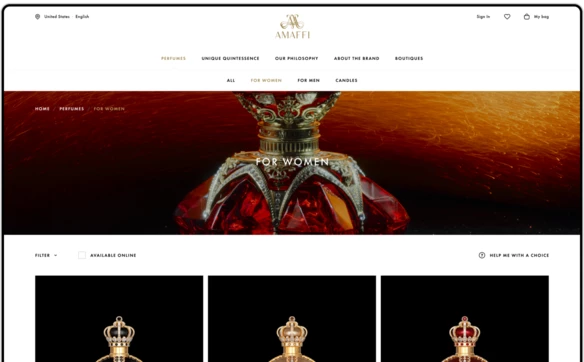
Amaffi luxury perfume direct-to-consumer website design case study
Amaffi, an ultra-luxury perfume brand with a long history, approached us to develop an eCommerce website that is true to its brand values, and conveys them effectively to customers, as well as is a best-in-class online store, where customers from all over the world can learn about their products, easily select the fragrances they like the best, and painlessly purchase and receive them.
Webshop UX design
The goals of the UX design phase were to introduce methods to improve customer conversion and retention, as well as to secure a solid foundation for brand-related communication later in the design. We based our work on a deep insight into the Amaffi business and products gained by numerous workshops with the client team and research into the category.
We applied best-in-class UX research into luxury eCommerce design in order to come up with an intuitive, functional and inspiring UX design that would satisfy both newcomers and brand aficionados, thanks to a bold emphasis on the quality of the products, unique brand essence and user experience that was designed specifically to allow navigating Amaffi products by their special attributes and styles.
To improve conversion rates we designed a simple and intuitive online store framework, equipped with a wishlist, customer account, suggestions for a similar product in the basket slip, and simple checkout. Wishlist and cart remainders, gifting, birthday greetings are designed to help increase customer retention rates.
Minimalistic visual design style
Elegant, laconic, and rich in high-class imagery - the website’s visual design was guided by the Amaffi brand's voice. The quality of the products, a rich history, and unique product design speak for themselves, reducing the necessity of adding decoration to a minimum. Along the same lines, the elaborate nature of the product is visualized in elaborate UI design, interactions and overall high-grade look and feel of the website. Highly artistic custom photos play a crucial role in product communication, and the rest of the UI is designed to support them.
Product selection wizard
To assist non-expert customers with little prior knowledge about the products, especially those who are looking to buy a present for someone else, as well as expert customers who are searching for a particular fragrance or ingredient, we designed a product selection wizard that helps users to identify and select their desired product by answering a set of questions. This helps them to find appropriate products without spending time evaluating each particular product.
Custom Sylius eShop implementation
The website is implemented on the Sylius eCommerce platform. Based on a powerful Symfony PHP framework, Sylius provides not only a robust e-store but also allows for the fast and painless implementation of custom business logic - taxes, product bundling, gifting, returns, that were specifically designed to match Amaffi’s unique requirements. The combination of Symfony and Sylius provides a solid basis for developing sophisticated eCommerce solutions that are easy to change, scale and maintain. This is increasingly crucial in an ever-changing business environment.
Simple and elegant checkout
The elegant look and feel accompany the user experience to the checkout counter where customers interact with a stripped-down yet extremely functional and elegant checkout process. The design supports the focused and efficient function of the module, creating a sense of class and value.
Product 3D presentation
Packaging plays an important role in the perfume industry. For Amaffi, it is especially true as the bottle and the packaging are state-of-the-art, and valuable collectables on their own. Along with the high-quality product photos the customers may preview the product using a 3D gallery, where they can spin the product around to indulge in the fine details and overall beauty of Amaffi’s creations.
Gift message
When shopping for loved ones, customers can augment their present with a personalized message that will be added to the product on a gold-embossed Amaffi gift card. The website provides an easy way to select the option and add the desired message.
Conclusion
As a result of the project, Amaffi received a new, modern storefront, which reflects the brand equity, is designed to boost customer conversion and retention rates, and is based on a custom implementation of the Sylius eCommerce platform to match Amaffi’s particular business requirements. We will maintain the project, proactively monitor how the customers use it, and introduce improvements to make it even more effective.
Get the edge with award-winning design and development for your eCommerce store!

