When we needed a recruiting tool, we grabbed hold of this idea and started to develop it. Finally, we came up with VideoApply, and we are actively using it now. It is now available for beta testing at videoapply.io. We will tell you about the 16 steps we took to make this product for which we were the customer, developer, and marketer at the same time.
Concept
1. Turning a need into a task
Vide Infra is growing and searching for top-rated specialists to join its team. At the same time, we have limited resources for recruiting. The first stage is normally the most painful. This is when we need to look through numerous responses and quickly decide which to discard and who to invite for a detailed interview. This is called screening. Usually, it is the most time-consuming part of the selection process.

It is obvious that we are not the only team for which screening has become a challenge. This is a typical situation for small businesses that face the challenges listed below
-
Many responses, little time. It is necessary to process many applications within a short time.
-
Difficult to reveal the candidate’s most valuable qualities. At the screening stage, you strive to get to know the candidate as a person: how well they can communicate, and how smart, sincere, and professional they are.
-
Uninformative resumes. You learn very little from resumes and emails. They leave too much room for bias.
-
Interview arrangements. It is hard to predict how much time the initial interview will take.
-
Scheduling. It takes much effort to coordinate a call schedule with all candidates and you must change it far too often.
-
Resources. If your company lacks an HR department, screening interviews become too costly.
It turns out that the basic screening tools: resumes, cover letters, and preliminary interviews are awkward and inefficient, especially for small companies.
We needed a tool that would help us conduct initial interviews. Then we realized that almost no resources of this type existed. Those that were available did not suit us. They either seriously lacked functionality or looked too underdeveloped. Furthermore, they left much to be desired in terms of their design. At the same time, our analysis showed that there was enough demand. The virtual interview software market was expected to grow.
The conclusion we came to was that we would have to make our own tool for screening interviews. What should a tool that would help us optimize hiring look like?
-
Visual. During a conversation, we perceive 50-80% of information visually and only the remaining 20-50% verbally. You can grasp a person’s image within a few seconds: how they position themselves, what their social attributes are, how thorough and attentive they are and so forth.
-
Asynchronous. The candidate can comfortably prepare and then, at their own convenience, make a recording while the employer can view it the same way. There is no need to align schedules.
-
Simple. On the one hand, the employer needs to quickly look through numerous candidates and decide who to invite for a live interview. The candidate, on the other hand, must clearly understand what is required from them and easily make a recording.
-
Comprehensive. The resource should be easily integrated into the company’s business processes. For example, it should allow for the convenient exchange of job application forms within the team.
UI design
2. Developing a user-friendly interface
First, we defined the basic functionality of the tool. It consists of two parts:
-
Employer accounts providing company information and allowing the posting of job openings.
-
Applicant accounts with options for video recording.

Interactive mockup for testing
We developed the pilot interface and carried out tests of these functions:
-
We drew an interactive Figma interface template that simulated responses to user actions.
-
We set the context and goals for UX tests: post a job, record a response, review a response, etc.
-
We ordered UX tests from third parties to get unbiased results. We collected feedback on whether the interface was easy to understand and user-friendly.
-
We made changes to the layout based on the feedback. We tried out new ideas and solutions.
First, third-party testing validated our ideas about how user-friendly the interface was. Second, outsourcing enabled us to perform tests in different markets, i.e. we had local users do them.
We developed the designs for the mobile and desktop versions simultaneously. We had a whole range of solutions after only a few iterations. Then we selected those that users liked in order to come up with a truly intuitive interface.
For example, we designed a unique applicant screen for responding to job postings. The testers ranked it highly. It boasts the following features:
-
The user sees the job opening information and their profile at the same time. They can look up some of the details when they make the recording. Information about the position and the company is divided into different tabs.
-
The application is intuitive and segmented: simple instructions, signup, and the recording window.
-
The signup form is minimalist. We left in only the essentials: name, resume, portfolio, and email confirmation to prevent the application from being lost.
-
The recording interface is pleasant to the eye. It features handy buttons and indicators that keep the user informed about the progress of the recording.
The sleek design and usability of this page are built upon many details: the design of input forms, window animations, element styles, etc. No template would have allowed for such a sophisticated interface. In addition, the state-of-the-art design customized for VideoApply would not have been attainable.
3. Abandoning templates to create a unique design
As with all of our projects, we took for granted that the interface had to be superior. The product was unfamiliar to the market which meant that it had to be as easy to understand as possible. The quality design set a high standard and inspired us to work more productively.
-
Employers should not have to put extra effort into integrating the tool into the company’s business processes. VideoApply should make this hassle-free.
-
The interface must inspire trust since applicants need to share personal information and use the camera.
Therefore, when we started the project, we decided to make a top-quality custom-made product that we would gladly use ourselves. Startups often resort to ready-made interface frameworks and templates in order to enter the market faster. Although this speeds up work, such products usually look mediocre and function just adequately. Standard solutions can rarely make it possible to create an easy-to-use tool that is also pleasant to the eye. Only after we had given up on these were we able to implement our ideas in the way we wanted.
We compiled a style guide. We described all the components that make up a page: text styles, colors, buttons, forms, fields, errors, etc.
We introduced animation. Animation is also part of our style guide. We described all dynamic elements directly in Figma at the design stage. We were very sensitive about the product bringing aesthetic pleasure. Users like highly responsive interfaces.
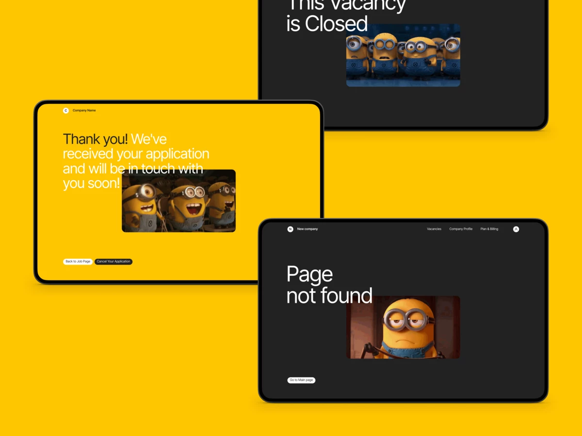
We added Easter eggs. We have hidden GIFs of the world's greatest employees (in our humble opinion) on error and some other pages just to cheer up users during their hiring routine.
Development
4. Structuring the work both on the front and backend
For front-end development, we chose Vue.js, a framework for creating web application interfaces. Back-end developers were faced with the task of creating an API for integration with the frontend.
Storybook helped us to simplify this. This tool allows you to record different states of individual UI components, check how well they function, and simultaneously maintain documentation for the backend. Therefore, when the first version of the frontend was completed, the backend developers immediately had clear guidelines as to what they should implement. We wrote the backend on the Symfony PHP framework. We use it for all projects because it is versatile and powerful.
5. Customizing the cloud services for the product
For many projects, we use Amazon Web Services (AWS). They can be flexibly customized for specific tasks. For VideoApply we used:
- Relational Database Service – for storing databases;
- Simple Storage Service (S3) – for storing files (video applications and documents sent by applicants);
- Elastic Compute Cloud (EC2) – for video processing;
- CloudFront CDN – for optimizing the video viewing experience;
- Simple Email Service – for sending emails.
We set up our work with AWS so that we are prepared for growth in the number of users in advance. Even now we are prepared to handle large volumes of video content and have addressed privacy issues.
Working with large volumes of video content
Each video that a user records is processed before it is saved. We check that it is a real video (and not some malicious code for example). We also set the appropriate format and quality for it. Processing can take several seconds. If the number of users recording videos at the same time changes dramatically, the server load can jump around and cause errors.
To avoid this, we process videos using EC2. It provides a virtual server for code execution. Its capacity automatically scales up should the need arise. Thus, the growth of user activity will not interfere with the stable operation of VideoApply.
Privacy
After applications are recorded, they do not go to the server where the project databases are stored. They are immediately sent to the S3 servers designed for storing large files. We have set up protected storage – user files are not available to third parties and will not be indexed by search engines.
Custdev
6. Reminding applicants to turn on their microphones
We performed functional testing inside the company and then started with custdev – testing on the target audience. We collected feedback from both employers and applicants, analyzed their needs, and added the necessary functions.
The testers complained that sometimes after they recorded the answers to the questions, they noticed that the recorded video had no audio. The reason was that they forgot to switch to the correct microphone, or the microphone was turned off. While they could follow the video being recorded in real-time, there was no way to get information about the audio.
-
We implemented a mechanism that checks the audio level and notifies the user if there is no sound.
-
We added error messages and indicators that signal the start and progress of the recording.
7. Helping applicants feel more confident
When a user records and saves a video, it is sent to file storage where it is accessed by the employer. Until the user saves the video, they can make a draft recording, revise it, and re-record it as many times as they want. Drafts are not stored anywhere. This seemed obvious to us because there was no need to do this or so we thought initially.
We did not, however, realize that self-presentation is a delicate process, and recording on camera increases the level of anxiety for many people. Users wanted to be confident that the employer would not see any unsuccessful takes.
-
We added a message to the recording stating that only user-approved videos are saved.
-
We set up a personal account for every applicant. This is a separate page with all responses. Each application can always be reviewed and deleted there so that there are no concerns about the security of personal data.
8. Simplifying responding to the job posting
We wanted applicants to go straight to the page where they could record a video once they clicked on a link from an employer. Any additional step complicates the response and can become an obstacle that would discourage applicants.
Therefore, we rejected a signup process for applicants. When an applicant visits the job opening page, they enter their email to receive a one-time code. For each session, authentication is done with this one-time code.
Even after it became clear that applicants needed personal accounts, we did not want to complicate the process of responding to a job opening. Thus, we simplified access to personal accounts. After the applicant responds, they are emailed a link to the account with a secret key which is read after they follow the link.
9. Securing post templates for employers
A screening interview requires only general questions that the applicant can answer quickly. Employers do not need to enter the questions manually every time. They can create templates with questions and use them for different job openings. We also created complete templates with the most typical questions.
10. Introducing teams and access levels
We added a page for company administration. Here, you can send an invitation to a company employee and set one of four access levels for them. For example, you can add a person who is permitted to view applications but cannot create new jobs. It becomes easier for teams to share applications within the company. In addition, it is now possible to create pages for several companies from a single account.
11. Making browsing through applications fast and clear
Initially, each job application had its own page. To watch the video, the employer had to open each application separately. This was inconvenient for screening out unsuitable applicants quickly. We wanted to enable the employer to view a particular response while not losing sight of the other job applications. We also wanted to divide them into groups.
We found the solution in the playlist interface which is familiar to most people. There is a column with all the responses on the left, while on the right, there is the application that is being viewed. There are the applicant’s contacts, their resume, and an option to like or dislike the application below it. This simple assessment allows the employer to sort the applications faster as they are moved to the appropriate tabs.
12. Simplifing navigation in the app
Asynchronous interviews are not yet a familiar tool although they are in demand. It is easy for the user to understand and navigate the website thanks to its numerous helpful features, such as hoverboards with instructions, status indicators, notifications about actions performed, etc.
13. Making sure the MVP is effective
The creation of VideoApply was carried out in parallel with the company’s usual work on customer projects and took longer than we wanted. We were desperate to launch it, but we could not enter the market with an unfinished product. We also had one great advantage – we needed VideoApply for ourselves. This allowed us to try out the MVP internally.
The tool worked exactly as it should – the search for employees was accelerated many times over. It made it easy to screen out unsuitable applicants. We did not expect, for example, that someone would consider it appropriate to smoke while recording. Or, when asked, “Why do you want to work for us?” answer “Who said that I want to?” in a challenging way. Just imagine how much time we would have wasted if we had to find slots in our schedule for such applicants and scrutinize their portfolios. Our approach made everything clear immediately.
On the whole, VideoApply was easy to integrate into our business processes and did exactly what we expected it to do.
Monetization
14. Implementing monetization
We created a high-quality product that we lacked ourselves. If it is effective, easy to use, and looks good, it will always be possible to come up with a way to monetize it.
We implemented the capability for subscription plans. We introduced limits on job postings, the number of responses, and team members.
We added a page for selecting the subscription plan. The differences between different plans are clearly shown. It is possible to change the plan and type of subscription (annual or monthly) or cancel it altogether. The activation date of the plan is indicated. We also kept the free plan. Its limits are very low but it allows users to familiarize themselves with all the features.
We made a dashboard. It contains information about active job openings, the current subscription plan, shows limits, and their renewal period.
After monetization was introduced, it became clear that users needed a dashboard to track their subscription.
We added notifications. To make it clear to the user what is going on, we notify them when their limits are exceeded, when their subscription expires, and when they change their rate plan.
We introduced limits. If the added job opening exceeds the limit, it is saved in drafts but does not become available to the public. If the received responses exceed the limit, it is displayed in the account but is not available for viewing.
We changed records in the database. Employers can cheat, i.e. delete a job opening for which the limit has been reached and then create the exact same job opening by restarting the counter. To prevent this, we never delete responses, but simply mark them as deleted. This allows them to be counted in a specific subscription period. In addition, this may be useful in the future for collecting statistics.
Marketing
15. Making a promotional website for the beta test
Promo site videoapply.io
VideoApply is open for beta testing. We invite you to take part in the beta testing at the videoapply.io promo site. We have a great deal of experience in creating similar sites. So, we made sure we came up with a reference promo for our own product. It features a hub with truly useful content on recruiting and remote interviewing and utilizes relevant SEO practices.
16. Email sequences configuration
Email sequences' structure
We prepared dozens of trigger emails. They are sent automatically in response to certain actions (or inaction).
We provided for many different scenarios:
-
We incentivize more active use of the service.
-
We suggest switching to a paid subscription.
-
We give instructions on how to get started and attract more responses.
-
We try to retain those who unsubscribe.
In general, we have made a deep dive into email marketing to increase loyalty and retain users.
P.S. What are our plans?
The next steps will depend on the results of the beta test: what feedback we get, how employers and job seekers use the website, and what paid features generate the most interest.
We also have new features to add:
-
One of the options we have developed and are about to introduce will enable employers to reply to applicants on the website so that they do not have to do it by email or through a messenger. Employers will be able to send a formal letter to an applicant or several applicants at the same time with a few clicks as well as track outgoing messages.
-
There will be an option for the team to leave comments and detailed assessment of applicants.
-
Integration with calendar services.
-
AI-assisted primary assessment and sorting of applications.
We created a tool we had dreamed of ourselves. We actively use VideoApply. It significantly simplifies and expedites recruiting.
Even if it does not bring the result we are hoping for, we are extremely happy that we have taken the path of a startup. The creation of VideoApply has provided us with experience that will transform into a new quality of work on products both for ourselves and our customers.
Working on VideoApply deepened our approach to developing a complex product. We started to better understand how to formulate and adjust an idea, create, test, improve the design, and develop the product.