Parametr is an unconventional commercial real estate developer. We helped them conceptualize their unique offerings and build a remarkable, practical website to express them.
Client and Task
Parametr offers customized solutions for businesses of various sizes. It builds industrial parks where customers can combine diverse premises: production, offices, warehouses, and showrooms. This approach stands out from traditional commercial developers, who usually focus on a specific facility, forcing companies to look for a warehouse from one developer and offices from another.

Parametr wanted a website that was bold and prominent enough to impress but not so much that it would scare off their conservative customers. Our goal was to create a site that:
-
Demonstrates Parametr as a reliable partner,
-
Explains their distinctive solutions,
-
Guides users through a flow that leads to a deal.
Message and Content
Parametr wondered how best to communicate their exceptional solution. We knew exactly what to do. We started by structuring their message through brand storytelling to create content for the homepage, which became the backbone of the entire site. Here is the structure:
-
Building Trust: Parametr is a new subsidiary in a large corporate group. The brand is fresh, but the team's resources and experience are immense. We emphasized this with concrete facts and figures.
-
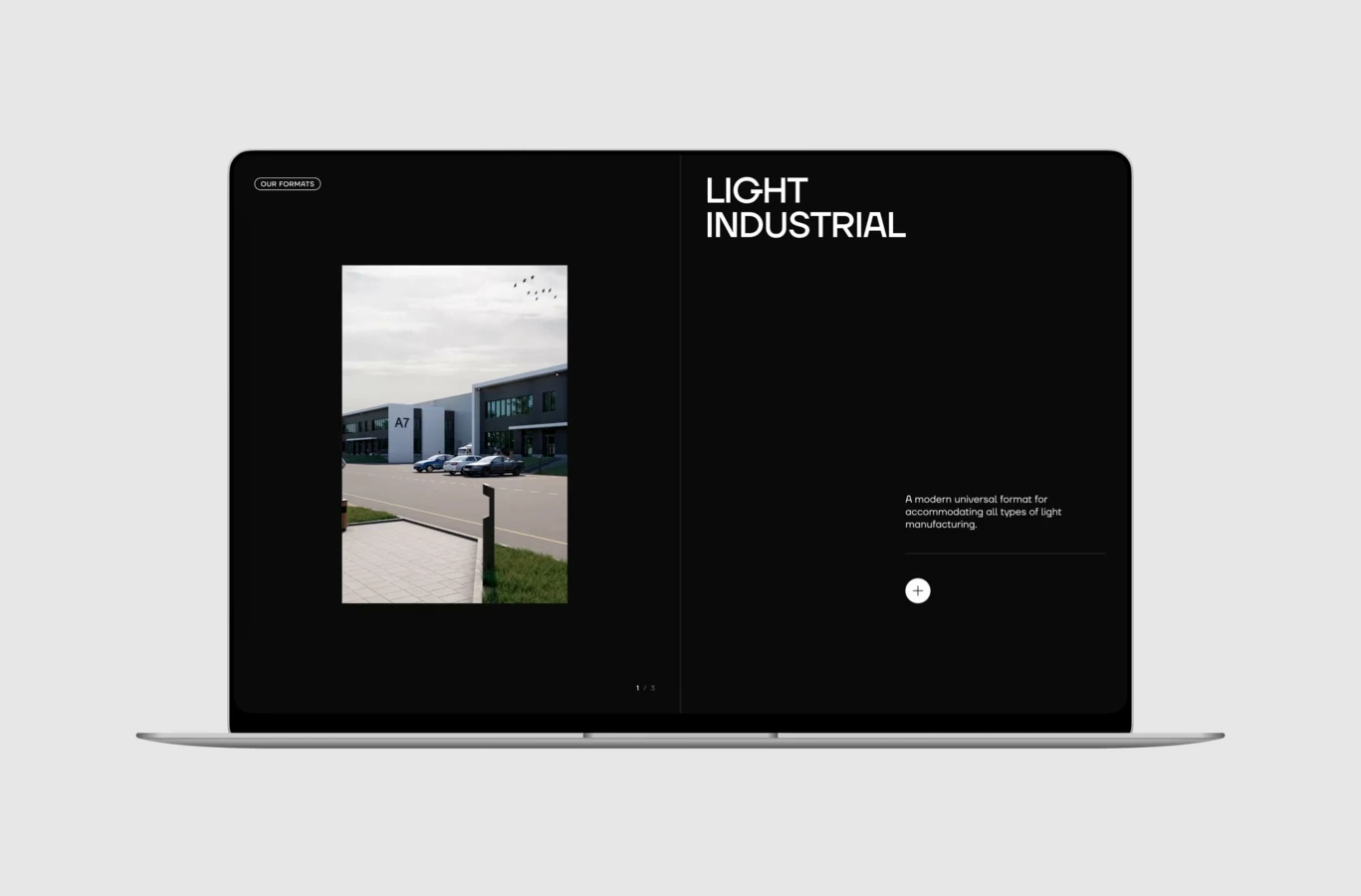
Product Presentation: We introduced users to Parametr’s array of solutions, such as Big Box, Light Industrial, and Built-to-Suit, explaining how they differ from conventional warehouse rentals.
-
Showcase: We highlighted current projects to demonstrate the company's scale, including specific property locations and essential information for corporate customers.
-
Values: We articulated the brand's core messages, which center around “efficiency parameters.”
-
Solutions for Businesses of All Sizes: By grouping clients according to business scale, we made it easy for users to identify their needs and see that Parametr understands their unique challenges and has relevant solutions.
Design Concept
Parametr had developed a strong visual brand that we instantly liked for its character. Rough, chopped shapes were brutalistic, stern, and daring. We improved the logo, fonts, colors, and bevel shapes from the brand book and added missing elements.
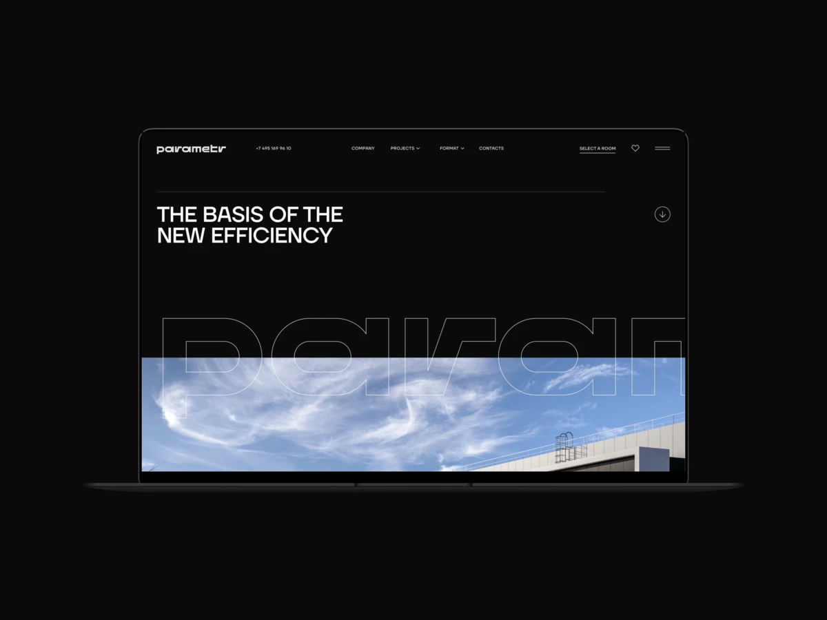
First, we created a homepage and discussed it with the company team to synchronize our expectations. It was a hit in terms of style. Every detail was elaborated to convey the brand’s energy, from the balanced composition to the specially made icons. The design made an impression of a solid company with excellent management and large-scale projects while being energetic, innovative, and technological.
Design Development
The next big step was to find a balance between conservatism and innovation. We wanted to create a striking website that realized the full potential of Parametr's vibrant brand while considering the needs and expectations of its customers. Here are the differences between the initial and final versions:
1. Composition
Initial: Many bold solutions: unconventional layout, full-width texts, and vertical texts.
Final: Refined grid structure, classic slider, and the removal of some provocatively large elements like giant quotes. We kept separate header layouts, contrasting large and small elements and others, maintaining the harsh industrial style but making it more coherent.
2. Title
Initial: An abstract “R” shape in the background highlighted the brand.
Final: “R” was removed from the title block and used in other site sections. The large logo looks fundamental and sets the tone for the entire site. We added a ticker animation to make the title catchy.
3. Animation
Initial: Entertaining elements, such as dynamic cards reacting to the cursor as a sliding puzzle.
Final: Subtle animation that guides a smooth scrolling experience.
4. Visual Content
Initial: A dramatic screen featuring a dynamic 3D model of a warehouse.
Final: Large, vibrant images that complement the white and grey palette of the page, efficiently displaying the projects and inspiring customers to dream about their future business. Every visual item can be managed via CMS.
The first version was bold and trendy, like a festival project. The site’s initial iteration pushed the brand’s unique aesthetic to the limit, with every detail related to the original Parametr brand. However, this design was too radical for the business environment. The final version is more straightforward and regular, with less brutalism and more air. As a result, the site became even more convincing and convenient.
Functional Solutions
The key question for Parametr customers is “Where?” Location is critical for a commercial property, especially if production, warehouse, and offices are in the same place. We made the answer as clear as possible by creating a separate page for each project (currently, three industrial parks) filled with visuals: videos, epic visualizations, and photos. Clients get information about logistics and are inspired by the grand scale. Most importantly, we developed a very handy selector.
Selector Interfac
The selector helps navigate among projects and formats. Its user flow is similar to that of residential flat selectors, which we are very experienced with:
- Set up filters.
- Select one of the options.
- Get details about a particular estate.
- Reach a manager.
We found a solution to keep the location always in sight by combining a map and a table with the premises’ details on one screen. A hover animation connects a mark on the map and an object in the list.
In the mobile version, the selector resembles a navigation app, so users do not need to make an effort to get used to the interface.
Parametr wanted the selector to be as pragmatic and informative as possible. We achieved this while keeping it aesthetic. Small buttons and fields contrast with large graphic shapes, making the page look balanced.
Property Selector Backend
We usually deploy a standard bundle for property selectors, but Parametr's needs differed from those of the residential property sites:
- Several projects are presented on the site simultaneously, and the properties are categorized by type, requiring two extra levels of filtering. We could have incorporated these levels into our standard selector, but doing so would have compromised its speed. Additionally, we were uncertain about the potential errors it might introduce.
- Parametr data needed to be imported in a specific format, so we rebuilt the selector from scratch to ensure accuracy and reliability.
Conclusion
We are very satisfied with the result we have achieved. The website meets the expectations of corporate clients, being straightforward and convincing. At the same time, the bold nature of the brand makes it stand out from the faceless commercial property websites. Parametr is definitely remarkable.